Chapter 6. Data Visualization and Storytelling for Decision-Makers
"The greatest value of a picture is when it forces us to notice what we never expected to see." — John Tukey
In the age of big data and advanced analytics, the ability to transform complex information into clear, compelling visual narratives has become a critical business skill. Data visualization is not merely about making charts look attractive—it's about enabling better, faster decisions by revealing patterns, highlighting anomalies, and communicating insights that would remain hidden in spreadsheets and statistical tables.
This chapter explores the art and science of data visualization and storytelling for business analytics. We'll examine fundamental design principles, cognitive psychology behind visual perception, practical techniques for creating effective charts and dashboards, and frameworks for crafting data-driven narratives that drive action. Whether you're presenting to executives, collaborating with analysts, or building self-service analytics tools, mastering these skills will amplify the impact of your analytical work.
6.1 Principles of Effective Data Visualization
Effective data visualization rests on several foundational principles that bridge design, psychology, and communication.
The Purpose-Driven Principle
Every visualization should have a clear purpose. Before creating any chart, ask:
- What question am I answering?
- What decision will this inform?
- What action should the viewer take?
- What is the single most important message?
Example:
- ❌ Poor: "Here's a chart showing our sales data"
- ✅ Good: "This chart shows that Q3 sales declined 15% in the Northeast region, requiring immediate attention"
The Simplicity Principle (Occam's Razor for Viz)
"Perfection is achieved not when there is nothing more to add, but when there is nothing left to take away." — Antoine de Saint-Exupéry
Key Guidelines:
- Remove chart junk: unnecessary gridlines, decorations, 3D effects
- Minimize cognitive load: one clear message per visualization
- Use direct labeling instead of legends when possible
- Eliminate redundant encodings
- Maximize data-ink ratio (Edward Tufte's principle)
Data-Ink Ratio Formula:
Data-Ink Ratio = (Ink used to display data) / (Total ink used in visualization)
Aim for a high ratio by removing non-essential elements.
The Accuracy Principle
Visualizations must represent data truthfully:
- Proportional scales : Bar charts must start at zero
- Consistent scales : Don't manipulate axes to exaggerate differences
- Appropriate chart types : Match the data structure and relationship
- Clear labeling : Units, time periods, sample sizes
- Uncertainty representation : Show confidence intervals, margins of error
The Accessibility Principle
Design for diverse audiences:
- Color blindness : Use colorblind-friendly palettes (avoid red-green combinations)
- Cultural context : Consider cultural interpretations of colors and symbols
- Technical literacy : Match complexity to audience expertise
- Device compatibility : Ensure readability on different screen sizes
- Alternative text : Provide descriptions for screen readers
The Aesthetic-Usability Effect
Research shows that people perceive aesthetically pleasing designs as more usable and trustworthy. However, aesthetics should enhance, not obscure, the data.
Balance:
- Professional appearance builds credibility
- Consistent styling aids comprehension
- Beauty should serve clarity, not replace it
6.2 Choosing the Right Chart for the Right Question
Different analytical questions require different visual approaches. The chart type should match both the data structure and the insight you want to communicate.
The Question-Chart Matrix
|
Question Type |
Best Chart Types |
Use When |
|
Comparison |
Bar chart, Column chart, Dot plot |
Comparing values across categories |
|
Trend over time |
Line chart, Area chart, Slope chart |
Showing change over continuous time periods |
|
Distribution |
Histogram, Box plot, Violin plot, Density plot |
Understanding data spread and outliers |
|
Relationship |
Scatter plot, Bubble chart, Heatmap |
Exploring correlation between variables |
|
Composition |
Stacked bar, Pie chart, Treemap, Waterfall |
Showing part-to-whole relationships |
|
Ranking |
Ordered bar chart, Lollipop chart, Slope chart |
Showing relative position or change in rank |
|
Geographic |
Choropleth map, Symbol map, Heat map |
Displaying spatial patterns |
|
Flow/Process |
Sankey diagram, Funnel chart, Network diagram |
Showing movement or connections |
Detailed Chart Selection Guide
1. Comparison Charts
Bar Chart (Horizontal)
- Best for: Comparing values across categories, especially with long category names
- When to use: 5-15 categories, emphasis on precise value comparison
- Avoid when: Showing trends over time (use line chart instead)
Python Example (Matplotlib & Seaborn):
import matplotlib.pyplot as plt
import seaborn as sns
import pandas as pd
# Sample data
data = pd.DataFrame({
'Region': ['Northeast', 'Southeast', 'Midwest', 'Southwest', 'West'],
'Sales': [245000, 198000, 312000, 267000, 289000]
})
# Sort by sales for better readability
data = data.sort_values('Sales')
# Create horizontal bar chart
fig, ax = plt.subplots(figsize=(10, 6))
sns.barplot(data=data, y='Region', x='Sales', palette='Blues_d', ax=ax)
# Formatting
ax.set_xlabel('Sales ($)', fontsize=12, fontweight='bold')
ax.set_ylabel('Region', fontsize=12, fontweight='bold')
ax.set_title('Q3 2024 Sales by Region', fontsize=14, fontweight='bold', pad=20)
# Add value labels
for i, v in enumerate(data['Sales']):
ax.text(v + 5000, i, f'${v:,.0f}', va='center', fontsize=10)
# Remove top and right spines
sns.despine()
plt.tight_layout()
plt.show()
Column Chart (Vertical)
- Best for: Time-based comparisons with few time periods
- When to use: 3-12 time periods or categories
- Avoid when: Too many categories (becomes cluttered)
2. Time Series Charts
Line Chart
- Best for: Continuous trends over time, multiple series comparison
- When to use: Many time periods (20+), showing overall patterns
- Avoid when: Too many overlapping lines (>5-7)
Python Example:
import matplotlib.pyplot as plt
import seaborn as sns
import pandas as pd
import numpy as np
# Generate sample time series data
dates = pd.date_range('2023-01-01', '2024-12-31', freq='M')
np.random.seed(42)
data = pd.DataFrame({
'Date': dates,
'Product_A': np.cumsum(np.random.randn(len(dates))) + 100,
'Product_B': np.cumsum(np.random.randn(len(dates))) + 95,
'Product_C': np.cumsum(np.random.randn(len(dates))) + 90
})
# Melt for easier plotting
data_long = data.melt(id_vars='Date', var_name='Product', value_name='Sales')
# Create line chart
fig, ax = plt.subplots(figsize=(12, 6))
sns.lineplot(data=data_long, x='Date', y='Sales', hue='Product',
linewidth=2.5, marker='o', markersize=4, ax=ax)
# Formatting
ax.set_xlabel('Month', fontsize=12, fontweight='bold')
ax.set_ylabel('Sales Index', fontsize=12, fontweight='bold')
ax.set_title('Product Sales Trends (2023-2024)', fontsize=14, fontweight='bold', pad=20)
ax.legend(title='Product', title_fontsize=11, fontsize=10, loc='upper left')
ax.grid(axis='y', alpha=0.3, linestyle='--')
sns.despine()
plt.tight_layout()
plt.show()
Area Chart
- Best for: Showing cumulative totals or emphasizing magnitude of change
- When to use: Stacked areas to show composition over time
- Avoid when: Areas overlap confusingly
3. Distribution Charts
Histogram
- Best for: Understanding frequency distribution of continuous data
- When to use: Exploring data shape, identifying outliers
- Avoid when: Comparing multiple distributions (use box plot or violin plot)
Box Plot
- Best for: Comparing distributions across categories, identifying outliers
- When to use: Multiple groups, need to show median and quartiles
- Avoid when: Audience unfamiliar with box plot interpretation
Python Example:
import matplotlib.pyplot as plt
import seaborn as sns
import pandas as pd
import numpy as np
# Generate sample data
np.random.seed(42)
data = pd.DataFrame({
'Region': np.repeat(['North', 'South', 'East', 'West'], 100),
'Response_Time': np.concatenate([
np.random.gamma(2, 2, 100),
np.random.gamma(2.5, 2, 100),
np.random.gamma(1.8, 2, 100),
np.random.gamma(2.2, 2, 100)
])
})
# Create figure with two subplots
fig, (ax1, ax2) = plt.subplots(1, 2, figsize=(14, 6))
# Box plot
sns.boxplot(data=data, x='Region', y='Response_Time', palette='Set2', ax=ax1)
ax1.set_title('Response Time Distribution by Region (Box Plot)',
fontsize=12, fontweight='bold')
ax1.set_ylabel('Response Time (seconds)', fontsize=11)
ax1.set_xlabel('Region', fontsize=11)
# Violin plot (shows distribution shape)
sns.violinplot(data=data, x='Region', y='Response_Time', palette='Set2', ax=ax2)
ax2.set_title('Response Time Distribution by Region (Violin Plot)',
fontsize=12, fontweight='bold')
ax2.set_ylabel('Response Time (seconds)', fontsize=11)
ax2.set_xlabel('Region', fontsize=11)
sns.despine()
plt.tight_layout()
plt.show()
Violin Plot
- Best for: Showing full distribution shape with density
- When to use: Comparing distributions with different shapes
- Avoid when: Audience unfamiliar with density plots
4. Relationship Charts
Scatter Plot
- Best for: Exploring correlation between two continuous variables
- When to use: Looking for patterns, clusters, outliers
- Avoid when: Too many points create overplotting (use hexbin or density)
Python Example with Regression Line:
import matplotlib.pyplot as plt
import seaborn as sns
import pandas as pd
import numpy as np
# Generate sample data
np.random.seed(42)
n = 200
data = pd.DataFrame({
'Marketing_Spend': np.random.uniform(10000, 100000, n),
})
data['Sales'] = data['Marketing_Spend'] * 2.5 + np.random.normal(0, 20000, n)
data['Region'] = np.random.choice(['North', 'South', 'East', 'West'], n)
# Create scatter plot with regression line
fig, ax = plt.subplots(figsize=(10, 6))
sns.scatterplot(data=data, x='Marketing_Spend', y='Sales',
hue='Region', style='Region', s=100, alpha=0.7, ax=ax)
sns.regplot(data=data, x='Marketing_Spend', y='Sales',
scatter=False, color='gray', ax=ax, line_kws={'linestyle':'--', 'linewidth':2})
# Formatting
ax.set_xlabel('Marketing Spend ($)', fontsize=12, fontweight='bold')
ax.set_ylabel('Sales ($)', fontsize=12, fontweight='bold')
ax.set_title('Marketing Spend vs. Sales by Region', fontsize=14, fontweight='bold', pad=20)
ax.legend(title='Region', title_fontsize=11, fontsize=10)
# Format axis labels
ax.ticklabel_format(style='plain', axis='both')
ax.xaxis.set_major_formatter(plt.FuncFormatter(lambda x, p: f'${x/1000:.0f}K'))
ax.yaxis.set_major_formatter(plt.FuncFormatter(lambda x, p: f'${x/1000:.0f}K'))
sns.despine()
plt.tight_layout()
plt.show()
Heatmap
- Best for: Showing patterns in matrix data, correlation matrices
- When to use: Many variables, looking for clusters or patterns
- Avoid when: Too many cells make individual values unreadable
Python Example (Correlation Matrix):
import matplotlib.pyplot as plt
import seaborn as sns
import pandas as pd
import numpy as np
# Generate sample data
np.random.seed(42)
data = pd.DataFrame({
'Sales': np.random.randn(100),
'Marketing': np.random.randn(100),
'Price': np.random.randn(100),
'Competition': np.random.randn(100),
'Seasonality': np.random.randn(100)
})
# Add some correlations
data['Sales'] = data['Marketing'] * 0.7 + data['Price'] * -0.5 + np.random.randn(100) * 0.3
data['Marketing'] = data['Marketing'] + data['Seasonality'] * 0.4
# Calculate correlation matrix
corr_matrix = data.corr()
# Create heatmap
fig, ax = plt.subplots(figsize=(8, 6))
sns.heatmap(corr_matrix, annot=True, fmt='.2f', cmap='coolwarm',
center=0, square=True, linewidths=1, cbar_kws={"shrink": 0.8}, ax=ax)
ax.set_title('Correlation Matrix: Sales Drivers', fontsize=14, fontweight='bold', pad=20)
plt.tight_layout()
plt.show()
5. Composition Charts
Stacked Bar Chart
- Best for: Showing part-to-whole relationships across categories
- When to use: Comparing both total and composition
- Avoid when: Too many segments make comparison difficult
Pie Chart
- Best for: Simple part-to-whole with 2-5 categories
- When to use: Showing proportions that sum to 100%
- Avoid when: More than 5 categories, precise comparison needed, multiple pies
⚠️ Pie Chart Controversy: Many data visualization experts (including Edward Tufte and Stephen Few) recommend avoiding pie charts because humans struggle to compare angles and areas accurately. Bar charts are almost always more effective.
Better Alternative to Pie Charts:
import matplotlib.pyplot as plt
import seaborn as sns
import pandas as pd
# Sample data
data = pd.DataFrame({
'Category': ['Product A', 'Product B', 'Product C', 'Product D', 'Product E'],
'Market_Share': [35, 25, 20, 12, 8]
})
# Sort by value
data = data.sort_values('Market_Share', ascending=True)
# Create horizontal bar chart (better than pie)
fig, ax = plt.subplots(figsize=(10, 6))
bars = ax.barh(data['Category'], data['Market_Share'], color=sns.color_palette('Set2'))
# Add percentage labels
for i, (cat, val) in enumerate(zip(data['Category'], data['Market_Share'])):
ax.text(val + 0.5, i, f'{val}%', va='center', fontsize=11, fontweight='bold')
# Formatting
ax.set_xlabel('Market Share (%)', fontsize=12, fontweight='bold')
ax.set_ylabel('Product', fontsize=12, fontweight='bold')
ax.set_title('Market Share by Product (Better than Pie Chart)',
fontsize=14, fontweight='bold', pad=20)
ax.set_xlim(0, 40)
sns.despine()
plt.tight_layout()
plt.show()
Treemap
- Best for: Hierarchical part-to-whole relationships
- When to use: Multiple levels of categorization
- Avoid when: Precise value comparison needed
6. Specialized Charts
Waterfall Chart
- Best for: Showing cumulative effect of sequential positive and negative values
- When to use: Budget variance, profit bridges, sequential changes
- Avoid when: Non-sequential data
Bullet Chart
- Best for: Comparing actual vs. target with context ranges
- When to use: KPI dashboards, performance tracking
- Avoid when: Simple comparison suffices
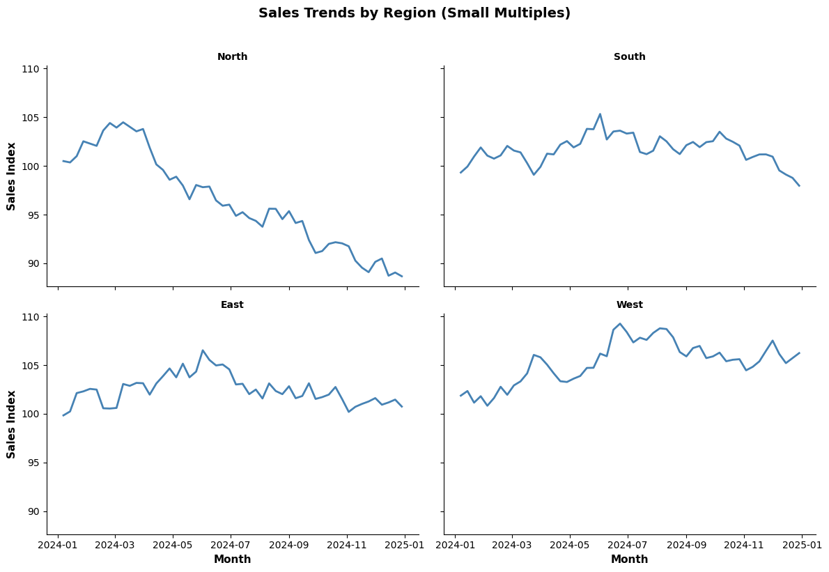
Small Multiples (Facet Grids)
- Best for: Comparing patterns across many categories
- When to use: Same chart type repeated for different segments
- Avoid when: Too many facets become overwhelming
Python Example:
import matplotlib.pyplot as plt
import seaborn as sns
import pandas as pd
import numpy as np
# Generate sample data
np.random.seed(42)
dates = pd.date_range('2024-01-01', '2024-12-31', freq='W')
regions = ['North', 'South', 'East', 'West']
data = []
for region in regions:
sales = np.cumsum(np.random.randn(len(dates))) + 100
for date, sale in zip(dates, sales):
data.append({'Date': date, 'Region': region, 'Sales': sale})
df = pd.DataFrame(data)
# Create small multiples
g = sns.FacetGrid(df, col='Region', col_wrap=2, height=4, aspect=1.5)
g.map(sns.lineplot, 'Date', 'Sales', color='steelblue', linewidth=2)
g.set_axis_labels('Month', 'Sales Index', fontsize=11, fontweight='bold')
g.set_titles('{col_name}', fontsize=12, fontweight='bold')
g.fig.suptitle('Sales Trends by Region (Small Multiples)',
fontsize=14, fontweight='bold', y=1.02)
plt.tight_layout()
plt.show()
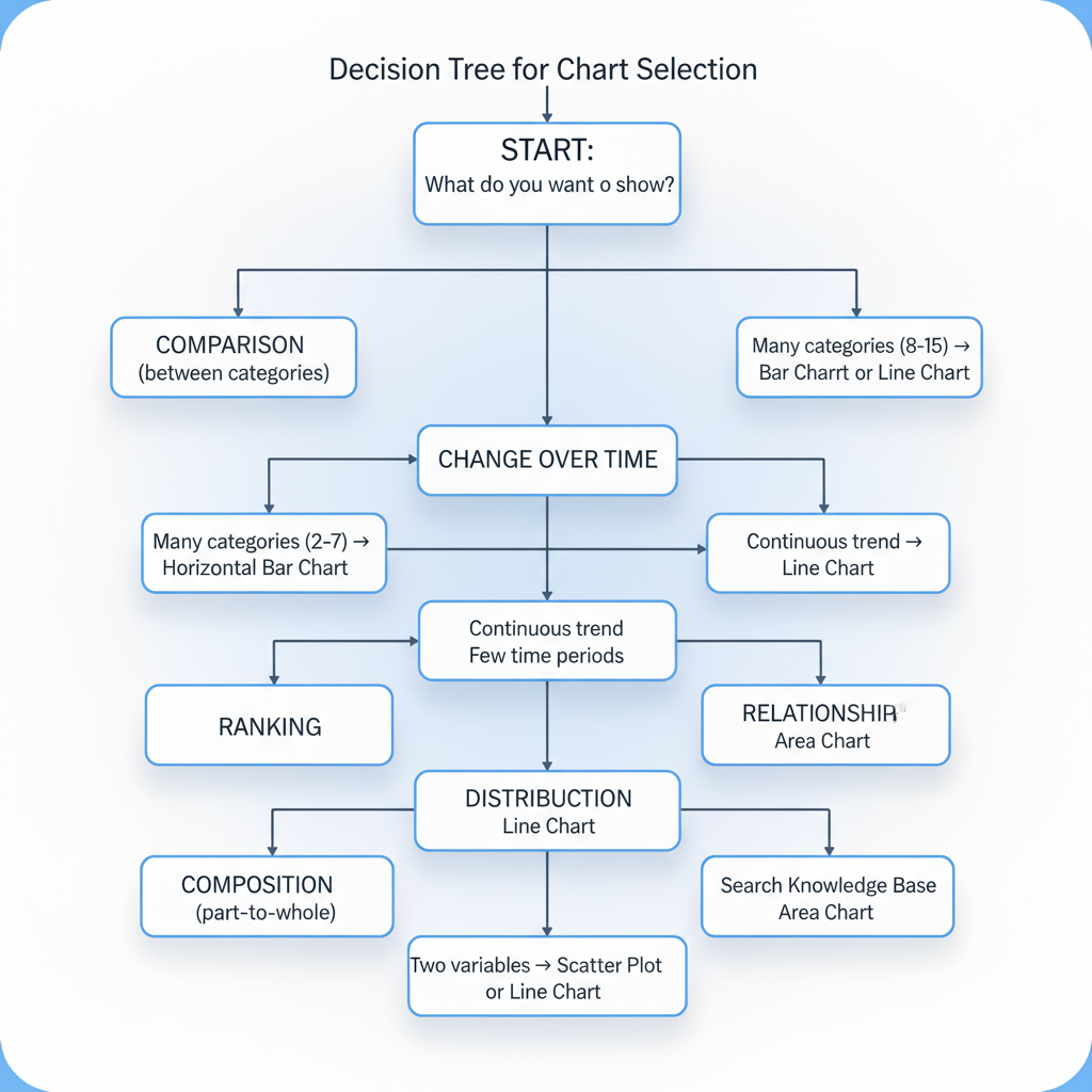
Decision Tree for Chart Selection
6.3 Visual Perception and Cognitive Load in Design
Understanding how humans perceive and process visual information is crucial for creating effective visualizations.
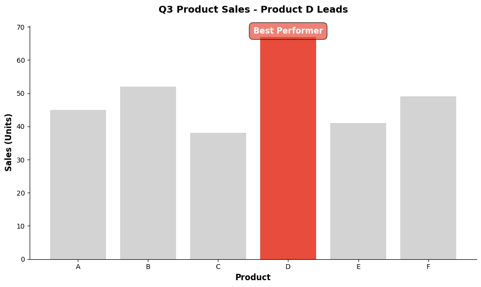
Pre-Attentive Attributes
Pre-attentive processing occurs in less than 500 milliseconds, before conscious attention. Certain visual attributes are processed pre-attentively:
Effective Pre-Attentive Attributes:
- Color (hue) : Different colors are instantly distinguishable
- Size : Larger objects stand out
- Position : Spatial location is immediately perceived
- Shape : Different shapes are quickly recognized
- Orientation : Tilted vs. vertical lines
- Motion : Movement attracts attention
- Intensity : Brightness differences
Design Implication: Use pre-attentive attributes to highlight the most important information.
Example:
import matplotlib.pyplot as plt
import seaborn as sns
import pandas as pd
# Sample data
data = pd.DataFrame({
'Product': ['A', 'B', 'C', 'D', 'E', 'F'],
'Sales': [45, 52, 38, 67, 41, 49]
})
# Highlight one bar using color (pre-attentive attribute)
colors = ['#d3d3d3' if x != 'D' else '#e74c3c' for x in data['Product']]
fig, ax = plt.subplots(figsize=(10, 6))
bars = ax.bar(data['Product'], data['Sales'], color=colors)
# Add annotation to highlighted bar
ax.annotate('Best Performer',
xy=('D', 67), xytext=('D', 72),
ha='center', fontsize=12, fontweight='bold',
bbox=dict(boxstyle='round,pad=0.5', facecolor='#e74c3c', alpha=0.7),
color='white')
ax.set_xlabel('Product', fontsize=12, fontweight='bold')
ax.set_ylabel('Sales (Units)', fontsize=12, fontweight='bold')
ax.set_title('Q3 Product Sales - Product D Leads', fontsize=14, fontweight='bold', pad=20)
sns.despine()
plt.tight_layout()
plt.show()
Gestalt Principles of Visual Perception
Gestalt psychology describes how humans naturally organize visual elements:
- Proximity : Objects close together are perceived as a group
- Similarity : Similar objects are perceived as related
- Enclosure : Objects within boundaries are perceived as a group
- Closure : We mentally complete incomplete shapes
- Continuity : We perceive continuous patterns
- Connection : Connected objects are perceived as related
Design Application:
import matplotlib.pyplot as plt
import seaborn as sns
import pandas as pd
import numpy as np
# Demonstrate proximity and grouping
fig, (ax1, ax2) = plt.subplots(1, 2, figsize=(14, 5))
# Poor design: no grouping
categories = ['Q1\nNorth', 'Q1\nSouth', 'Q2\nNorth', 'Q2\nSouth',
'Q3\nNorth', 'Q3\nSouth', 'Q4\nNorth', 'Q4\nSouth']
values = [45, 38, 52, 41, 48, 44, 55, 49]
ax1.bar(range(len(categories)), values, color='steelblue')
ax1.set_xticks(range(len(categories)))
ax1.set_xticklabels(categories, fontsize=9)
ax1.set_title('Poor: No Visual Grouping', fontsize=12, fontweight='bold')
ax1.set_ylabel('Sales', fontsize=11)
# Good design: grouped by quarter using proximity and color
data = pd.DataFrame({
'Quarter': ['Q1', 'Q1', 'Q2', 'Q2', 'Q3', 'Q3', 'Q4', 'Q4'],
'Region': ['North', 'South', 'North', 'South', 'North', 'South', 'North', 'South'],
'Sales': values
})
x = np.arange(4)
width = 0.35
north_sales = [45, 52, 48, 55]
south_sales = [38, 41, 44, 49]
ax2.bar(x - width/2, north_sales, width, label='North', color='#3498db')
ax2.bar(x + width/2, south_sales, width, label='South', color='#e74c3c')
ax2.set_xticks(x)
ax2.set_xticklabels(['Q1', 'Q2', 'Q3', 'Q4'])
ax2.set_title('Better: Grouped by Quarter and Region', fontsize=12, fontweight='bold')
ax2.set_ylabel('Sales', fontsize=11)
ax2.set_xlabel('Quarter', fontsize=11)
ax2.legend()
sns.despine()
plt.tight_layout()
plt.show()
Cognitive Load Theory
Cognitive load refers to the mental effort required to process information. Effective visualizations minimize extraneous cognitive load.
Types of Cognitive Load:
- Intrinsic Load : Inherent complexity of the information
- Extraneous Load : Unnecessary complexity from poor design
- Germane Load : Mental effort devoted to understanding and learning
Strategies to Reduce Extraneous Load:
✅ DO:
- Use consistent color schemes
- Align elements on a grid
- Use direct labeling instead of legends
- Provide clear titles and axis labels
- Group related information
- Use white space effectively
❌ DON'T:
- Use 3D effects (distort perception)
- Rotate text unnecessarily
- Use too many colors
- Include decorative elements
- Create visual clutter
- Force users to decode complex legends
The Hierarchy of Visual Encodings
Cleveland and McGill (1984) ranked visual encodings by accuracy:
Most Accurate → Least Accurate:
- Position along a common scale (bar chart, dot plot)
- Position along non-aligned scales (small multiples)
- Length, direction, angle
- Area (bubble chart)
- Volume, curvature
- Shading, color saturation
Design Implication: Use position and length for the most important comparisons.
Color Theory for Data Visualization
Types of Color Palettes:
-
Sequential
: For ordered data (low to high)
- Example: Light blue → Dark blue
- Use for: Heatmaps, choropleth maps, continuous values
-
Diverging
: For data with a meaningful midpoint
- Example: Red ← White → Blue
- Use for: Positive/negative values, deviations from average
-
Categorical
: For distinct categories
- Example: Distinct hues (blue, orange, green)
- Use for: Nominal categories with no order
Colorblind-Friendly Palettes:
import matplotlib.pyplot as plt
import seaborn as sns
import pandas as pd
# Sample data
data = pd.DataFrame({
'Category': ['A', 'B', 'C', 'D', 'E'],
'Value': [23, 45, 56, 34, 67]
})
# Create figure with different palettes
fig, axes = plt.subplots(2, 2, figsize=(14, 10))
# Default palette (not colorblind-friendly)
sns.barplot(data=data, x='Category', y='Value', palette='Set1', ax=axes[0, 0])
axes[0, 0].set_title('Default Palette (Not Colorblind-Friendly)', fontweight='bold')
# Colorblind-friendly palette 1
sns.barplot(data=data, x='Category', y='Value', palette='colorblind', ax=axes[0, 1])
axes[0, 1].set_title('Colorblind-Friendly Palette', fontweight='bold')
# Colorblind-friendly palette 2 (IBM Design)
ibm_colors = ['#648fff', '#785ef0', '#dc267f', '#fe6100', '#ffb000']
sns.barplot(data=data, x='Category', y='Value', palette=ibm_colors, ax=axes[1, 0])
axes[1, 0].set_title('IBM Design Colorblind-Safe Palette', fontweight='bold')
# Grayscale (ultimate accessibility)
sns.barplot(data=data, x='Category', y='Value', palette='Greys', ax=axes[1, 1])
axes[1, 1].set_title('Grayscale (Works for Everyone)', fontweight='bold')
plt.tight_layout()
plt.show()
Color Best Practices:
✅ DO:
- Use color purposefully, not decoratively
- Limit to 5-7 distinct colors
- Ensure sufficient contrast (WCAG AA: 4.5:1 for text)
- Test with colorblind simulators
- Use color + another encoding (shape, pattern)
❌ DON'T:
- Use red-green combinations (most common colorblindness)
- Rely solely on color to convey information
- Use rainbow color schemes for sequential data
- Use too many similar shades
6.4 Avoiding Misleading Visualizations
Visualizations can mislead intentionally or unintentionally. Understanding common pitfalls helps create honest, trustworthy charts.
Common Misleading Techniques
1. Truncated Y-Axis
Problem: Starting the y-axis above zero exaggerates differences.
import matplotlib.pyplot as plt
import seaborn as sns
import pandas as pd
data = pd.DataFrame({
'Month': ['Jan', 'Feb', 'Mar', 'Apr', 'May'],
'Sales': [98, 99, 97, 100, 101]
})
fig, (ax1, ax2) = plt.subplots(1, 2, figsize=(14, 5))
# Misleading: truncated axis
ax1.plot(data['Month'], data['Sales'], marker='o', linewidth=2, markersize=8, color='#e74c3c')
ax1.set_ylim(95, 102)
ax1.set_title('❌ MISLEADING: Truncated Y-Axis\n(Exaggerates small changes)',
fontsize=12, fontweight='bold', color='#e74c3c')
ax1.set_ylabel('Sales', fontsize=11)
ax1.grid(axis='y', alpha=0.3)
# Honest: full axis
ax2.plot(data['Month'], data['Sales'], marker='o', linewidth=2, markersize=8, color='#27ae60')
ax2.set_ylim(0, 110)
ax2.set_title('✅ HONEST: Full Y-Axis\n(Shows true scale of change)',
fontsize=12, fontweight='bold', color='#27ae60')
ax2.set_ylabel('Sales', fontsize=11)
ax2.grid(axis='y', alpha=0.3)
sns.despine()
plt.tight_layout()
plt.show()
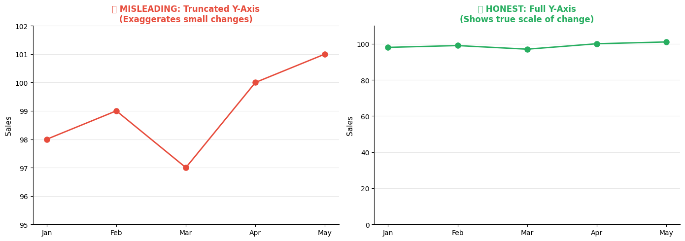
When Truncation is Acceptable:
- Small variations are meaningful (stock prices, quality metrics)
- Clearly indicate the break with a visual marker
- Context makes the scale obvious
- Include a reference line (e.g., target, average)
2. Inconsistent Scales
Problem: Using different scales for comparison misleads viewers.
import matplotlib.pyplot as plt
import pandas as pd
import numpy as np
# Sample data
months = ['Jan', 'Feb', 'Mar', 'Apr', 'May', 'Jun']
product_a = [100, 110, 105, 115, 120, 125]
product_b = [50, 52, 51, 53, 55, 57]
fig, (ax1, ax2) = plt.subplots(1, 2, figsize=(14, 5))
# Misleading: different scales
ax1_twin = ax1.twinx()
ax1.plot(months, product_a, marker='o', linewidth=2, color='#3498db', label='Product A')
ax1_twin.plot(months, product_b, marker='s', linewidth=2, color='#e74c3c', label='Product B')
ax1.set_ylabel('Product A Sales', fontsize=11, color='#3498db')
ax1_twin.set_ylabel('Product B Sales', fontsize=11, color='#e74c3c')
ax1.set_title('❌ MISLEADING: Different Scales\n(Makes products look similar)',
fontsize=12, fontweight='bold', color='#e74c3c')
ax1.tick_params(axis='y', labelcolor='#3498db')
ax1_twin.tick_params(axis='y', labelcolor='#e74c3c')
# Honest: same scale
ax2.plot(months, product_a, marker='o', linewidth=2, color='#3498db', label='Product A')
ax2.plot(months, product_b, marker='s', linewidth=2, color='#e74c3c', label='Product B')
ax2.set_ylabel('Sales (Units)', fontsize=11)
ax2.set_title('✅ HONEST: Same Scale\n(Shows true relative performance)',
fontsize=12, fontweight='bold', color='#27ae60')
ax2.legend()
ax2.grid(axis='y', alpha=0.3)
sns.despine()
plt.tight_layout()
plt.show()
3. Cherry-Picking Time Ranges
Problem: Selecting specific time periods to support a narrative.
Solution: Show full context, or clearly explain why a specific range is relevant.
4. Misleading Area/Volume Representations
Problem: Scaling both dimensions of 2D objects or using 3D when representing 1D data.
Example: If sales doubled, showing a circle with double the radius (which quadruples the area) is misleading.
5. Improper Aggregation
Problem: Aggregating data in ways that hide important patterns or outliers.
Solution: Show distributions, not just averages. Include error bars or confidence intervals.
The Ethics of Data Visualization
Principles of Honest Visualization:
- Transparency : Clearly state data sources, sample sizes, time periods
- Context : Provide benchmarks, historical trends, industry standards
- Completeness : Don't omit data that contradicts your narrative
- Accuracy : Represent proportions and scales truthfully
- Clarity : Make limitations and uncertainties visible
Red Flags for Misleading Visualizations:
🚩 Y-axis doesn't start at zero (without good reason) 🚩 Inconsistent scales or intervals 🚩 Missing labels, legends, or units 🚩 Cherry-picked time ranges 🚩 3D effects that distort perception 🚩 Dual axes that create false correlations 🚩 Omitted error bars or confidence intervals 🚩 Aggregations that hide important details
6.5 Designing Dashboards for Executives vs. Analysts
Different audiences have different needs, expertise levels, and decision contexts. Effective dashboard design adapts to the user.
Executive Dashboards
Characteristics:
- High-level : Strategic KPIs, not operational details
- Actionable : Focus on exceptions and decisions needed
- Concise : Fit on one screen, minimal scrolling
- Visual : More charts, fewer tables
- Contextual : Comparisons to targets, benchmarks, trends
Design Principles:
- The 5-Second Rule : Most important insight visible in 5 seconds
- Exception-Based : Highlight what needs attention
- Trend-Focused : Show direction, not just current state
- Minimal Interaction : Limited drill-down, mostly static
- Business Language : Avoid technical jargon
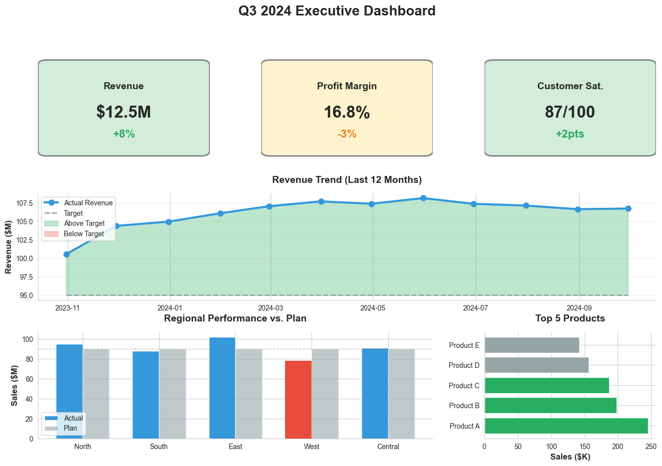
Python Example (Executive Dashboard Style):
import matplotlib.pyplot as plt
import matplotlib.patches as mpatches
import seaborn as sns
import pandas as pd
import numpy as np
# Set style
sns.set_style("whitegrid")
fig = plt.figure(figsize=(16, 10))
gs = fig.add_gridspec(3, 3, hspace=0.3, wspace=0.3)
# Title
fig.suptitle('Q3 2024 Executive Dashboard', fontsize=20, fontweight='bold', y=0.98)
# KPI Cards (Top Row)
kpis = [
{'title': 'Revenue', 'value': '$12.5M', 'change': '+8%', 'status': 'good'},
{'title': 'Profit Margin', 'value': '16.8%', 'change': '-3%', 'status': 'warning'},
{'title': 'Customer Sat.', 'value': '87/100', 'change': '+2pts', 'status': 'good'}
]
for i, kpi in enumerate(kpis):
ax = fig.add_subplot(gs[0, i])
ax.axis('off')
# Background color based on status
bg_color = '#d4edda' if kpi['status'] == 'good' else '#fff3cd'
rect = mpatches.FancyBboxPatch((0.05, 0.1), 0.9, 0.8,
boxstyle="round,pad=0.05",
facecolor=bg_color, edgecolor='gray', linewidth=2)
ax.add_patch(rect)
# Text
ax.text(0.5, 0.7, kpi['title'], ha='center', va='center',
fontsize=14, fontweight='bold', transform=ax.transAxes)
ax.text(0.5, 0.45, kpi['value'], ha='center', va='center',
fontsize=24, fontweight='bold', transform=ax.transAxes)
change_color = '#27ae60' if kpi['status'] == 'good' else '#e67e22'
ax.text(0.5, 0.25, kpi['change'], ha='center', va='center',
fontsize=16, color=change_color, fontweight='bold', transform=ax.transAxes)
# Revenue Trend (Middle Row, spans all columns)
ax_trend = fig.add_subplot(gs[1, :])
months = pd.date_range('2023-10-01', '2024-09-30', freq='M')
revenue = np.cumsum(np.random.randn(12)) + 100
target = [95] * 12
ax_trend.plot(months, revenue, marker='o', linewidth=3, markersize=8,
color='#3498db', label='Actual Revenue')
ax_trend.plot(months, target, linestyle='--', linewidth=2,
color='#95a5a6', label='Target')
ax_trend.fill_between(months, revenue, target, where=(revenue >= target),
alpha=0.3, color='#27ae60', label='Above Target')
ax_trend.fill_between(months, revenue, target, where=(revenue < target),
alpha=0.3, color='#e74c3c', label='Below Target')
ax_trend.set_title('Revenue Trend (Last 12 Months)', fontsize=14, fontweight='bold', pad=15)
ax_trend.set_ylabel('Revenue ($M)', fontsize=12, fontweight='bold')
ax_trend.legend(loc='upper left', fontsize=10)
ax_trend.grid(axis='y', alpha=0.3)
sns.despine(ax=ax_trend)
# Regional Performance (Bottom Left)
ax_region = fig.add_subplot(gs[2, :2])
regions = ['North', 'South', 'East', 'West', 'Central']
actual = [95, 88, 102, 78, 91]
plan = [90, 90, 90, 90, 90]
x = np.arange(len(regions))
width = 0.35
bars1 = ax_region.bar(x - width/2, actual, width, label='Actual', color='#3498db')
bars2 = ax_region.bar(x + width/2, plan, width, label='Plan', color='#95a5a6', alpha=0.6)
# Highlight underperforming region
bars1[3].set_color('#e74c3c')
ax_region.set_title('Regional Performance vs. Plan', fontsize=14, fontweight='bold', pad=15)
ax_region.set_ylabel('Sales ($M)', fontsize=12, fontweight='bold')
ax_region.set_xticks(x)
ax_region.set_xticklabels(regions)
ax_region.legend(fontsize=10)
ax_region.axhline(y=90, color='gray', linestyle='--', linewidth=1, alpha=0.5)
sns.despine(ax=ax_region)
# Top Products (Bottom Right)
ax_products = fig.add_subplot(gs[2, 2])
products = ['Product A', 'Product B', 'Product C', 'Product D', 'Product E']
sales = [245, 198, 187, 156, 142]
colors_prod = ['#27ae60' if s > 180 else '#95a5a6' for s in sales]
ax_products.barh(products, sales, color=colors_prod)
ax_products.set_title('Top 5 Products', fontsize=14, fontweight='bold', pad=15)
ax_products.set_xlabel('Sales ($K)', fontsize=12, fontweight='bold')
sns.despine(ax=ax_products)
plt.tight_layout()
plt.show()
Analyst Dashboards
Characteristics:
- Detailed : Operational metrics, granular data
- Interactive : Extensive filtering, drill-down, exploration
- Comprehensive : Multiple views, tabs, scrolling acceptable
- Data-Rich : Tables, detailed charts, statistical summaries
- Technical : Can include technical terms and advanced metrics
Design Principles:
- Exploration-Focused : Enable ad-hoc analysis
- Drill-Down Capability : From summary to detail
- Flexible Filtering : Multiple dimensions, date ranges
- Data Export : Allow downloading underlying data
- Technical Precision : Show exact values, statistical measures
Comparison Matrix
|
Aspect |
Executive Dashboard |
Analyst Dashboard |
|
Primary Goal |
Monitor performance, identify issues |
Explore data, find insights |
|
Detail Level |
High-level KPIs |
Granular metrics |
|
Interactivity |
Minimal |
Extensive |
|
Layout |
Single screen |
Multiple tabs/pages |
|
Update Frequency |
Daily/Weekly |
Real-time/Hourly |
|
Chart Types |
Simple (bar, line, KPI cards) |
Complex (scatter, heatmap, distributions) |
|
Text |
Minimal, large fonts |
Detailed, smaller fonts acceptable |
|
Colors |
Status indicators (red/yellow/green) |
Categorical distinctions |
|
Audience Expertise |
Business-focused |
Technically proficient |
|
Decision Type |
Strategic, high-level |
Tactical, operational |
Universal Dashboard Design Principles
Regardless of audience:
- Clear Hierarchy : Most important information first
- Consistent Layout : Predictable structure across pages
- Responsive Design : Works on different screen sizes
- Performance : Fast load times, optimized queries
- Accessibility : Colorblind-friendly, screen reader compatible
- Documentation : Clear definitions, data sources, update times
6.6 Data Storytelling: From Insights to Narrative
Data storytelling transforms analytical findings into compelling narratives that drive understanding and action.
Why Storytelling Matters
The Science:
- Stories are 22 times more memorable than facts alone (Stanford study)
- Narratives activate multiple brain regions , enhancing comprehension and retention
- Emotional engagement through stories increases persuasiveness by 30%
- Stories provide context and meaning , making abstract data relatable
Business Impact:
- Faster decision-making
- Stronger stakeholder buy-in
- Better retention of insights
- Increased likelihood of action
The Elements of Data Storytelling
1. Data (The Foundation)
- Accurate, relevant, trustworthy
- Properly analyzed and validated
- Sufficient to support claims
2. Narrative (The Structure)
- Clear beginning, middle, end
- Logical flow of ideas
- Compelling arc with tension and resolution
3. Visuals (The Amplifier)
- Reinforce key messages
- Simplify complex information
- Create emotional impact
The Sweet Spot:
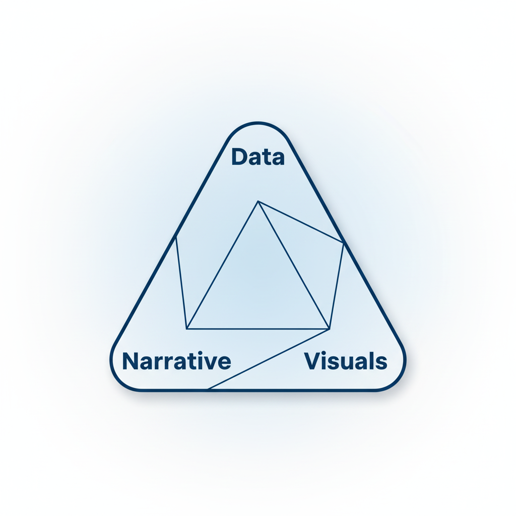
All three elements must work together for maximum impact.
6.6.1 Structuring a Story: Context, Conflict, Resolution
Effective data stories follow a narrative arc:
The Three-Act Structure
Act 1: Context (Setup)
- What: Establish the situation
- Why it matters: Connect to business goals
- Who: Identify stakeholders
- When/Where: Set the scene
Example Opening:
"Our customer retention rate has been our competitive advantage for five years, consistently outperforming the industry average of 85%. However, recent trends suggest this may be changing."
Act 2: Conflict (Complication)
- The problem: What's wrong or changing
- The evidence: Data that reveals the issue
- The stakes: Why this matters
- The tension: What happens if unaddressed
Example Complication:
"In Q3, our retention rate dropped to 82% for the first time, with the decline concentrated in customers aged 25-34. This segment represents 40% of our revenue and has the highest lifetime value. If this trend continues, we project a $5M revenue impact over the next 12 months."
Act 3: Resolution (Solution)
- The insight: What the data reveals
- The recommendation: What should be done
- The evidence: Why this will work
- The call to action: Next steps
Example Resolution:
"Analysis reveals that 25-34 year-olds are switching to competitors offering mobile-first experiences. Our mobile app has a 3.2-star rating compared to competitors' 4.5+ ratings. By investing $500K in mobile app improvements—specifically checkout flow and personalization—we can recover retention rates within two quarters, based on A/B test results showing 15% improvement in engagement."
Alternative Structures
The Hero's Journey (for transformation stories):
- Ordinary world (current state)
- Call to adventure (opportunity or threat)
- Challenges and trials (obstacles, data exploration)
- Revelation (key insight)
- Transformation (recommended change)
- Return with elixir (expected outcomes)
The Pyramid Principle (for executive audiences):
- Start with the answer/recommendation
- Provide supporting arguments
- Back each argument with data
- Anticipate and address objections
The Problem-Solution Framework:
- Problem statement
- Impact quantification
- Root cause analysis
- Solution options
- Recommended approach
- Implementation plan
6.6.2 Tailoring to Stakeholders and Decision Context
Different audiences require different approaches:
Stakeholder Analysis Matrix
|
Stakeholder |
Primary Interest |
Key Metrics |
Communication Style |
Visualization Preference |
|
CEO |
Strategic impact, competitive position |
Revenue, market share, ROI |
Concise, high-level |
Simple charts, KPIs |
|
CFO |
Financial implications, ROI |
Costs, revenue, margins, NPV |
Data-driven, precise |
Tables, waterfall charts |
|
CMO |
Customer impact, brand |
Customer metrics, campaign ROI |
Creative, customer-focused |
Journey maps, funnels |
|
COO |
Operational efficiency, execution |
Process metrics, productivity |
Practical, action-oriented |
Process flows, Gantt charts |
|
Data Team |
Methodology, technical details |
Statistical measures, model performance |
Technical, detailed |
Complex charts, distributions |
|
Frontline |
Practical application, ease of use |
Daily operational metrics |
Simple, actionable |
Simple dashboards, alerts |
Adapting Your Story
For Executives:
- Lead with the recommendation
- Focus on business impact, not methodology
- Use analogies and metaphors
- Keep it to 3-5 key points
- Anticipate "So what?" questions
For Technical Audiences:
- Explain methodology and assumptions
- Show statistical rigor
- Discuss limitations and alternatives
- Provide access to detailed data
- Invite critique and collaboration
For Cross-Functional Teams:
- Connect to multiple perspectives
- Use inclusive language
- Provide context for non-experts
- Show how different functions are affected
- Facilitate discussion and questions
Decision Context Matters
Urgent Decisions:
- Get to the point immediately
- Focus on actionable insights
- Provide clear recommendation
- Minimize background information
Strategic Decisions:
- Provide comprehensive context
- Explore multiple scenarios
- Discuss long-term implications
- Allow time for deliberation
Consensus-Building:
- Acknowledge different perspectives
- Show how data addresses concerns
- Facilitate discussion
- Build toward shared understanding
Storytelling Techniques
1. The Hook
Start with something that grabs attention:
Surprising Statistic:
"We're losing $50,000 every day to a problem we didn't know existed."
Provocative Question:
"What if I told you our best-selling product is actually losing us money?"
Relatable Scenario:
"Imagine you're a customer trying to complete a purchase on our mobile app at 11 PM..."
2. The Contrast
Highlight change or difference:
Before/After:
"Six months ago, our average response time was 24 hours. Today, it's 2 hours."
Us vs. Them:
"While our competitors are growing mobile sales by 40%, ours declined 5%."
Expected vs. Actual:
"We expected the promotion to increase sales by 10%. It decreased them by 3%."
3. The Concrete Example
Make abstract data tangible:
Customer Story:
"Meet Sarah, a typical customer in our 25-34 segment. She tried to use our app three times last month and abandoned her cart each time due to checkout errors."
Specific Instance:
"On October 15th, our system went down for 47 minutes during peak shopping hours, resulting in 1,247 lost transactions."
4. The Analogy
Explain complex concepts through comparison:
Technical Concept:
"Our recommendation algorithm is like a personal shopper who learns your preferences over time."
Scale:
"The data quality issues we're facing are like trying to build a house on a foundation with cracks—no matter how beautiful the house, it's not stable."
5. The Emotional Connection
Connect data to human impact:
Employee Impact:
"These efficiency gains mean our customer service team can spend 30% more time on complex issues that require human empathy, rather than routine tasks."
Customer Impact:
"Reducing load time by 2 seconds means 50,000 customers per month don't experience frustration and abandonment."
The Importance of Storytelling: Key Principles
✅ DO:
-
Know Your Audience
- Research their priorities and concerns
- Use their language and terminology
- Address their specific decision context
-
Have a Clear Message
- One primary insight per story
- Support with 2-3 key points
- Make the "so what" explicit
-
Use Narrative Structure
- Beginning, middle, end
- Build tension and resolution
- Create a logical flow
-
Show, Don't Just Tell
- Use visuals to reinforce points
- Provide concrete examples
- Demonstrate with data
-
Make It Actionable
- Clear recommendations
- Specific next steps
- Defined ownership and timeline
-
Build Credibility
- Cite data sources
- Acknowledge limitations
- Show your work (when appropriate)
-
Practice and Refine
- Rehearse your delivery
- Get feedback
- Iterate on your story
❌ DON'T:
-
Don't Bury the Lead
- Avoid lengthy setup before the main point
- Don't make executives wait for the punchline
- Get to the "so what" quickly
-
Don't Overwhelm with Data
- Avoid data dumps
- Don't show every analysis you did
- Resist the urge to include "just in case" slides
-
Don't Use Jargon
- Avoid technical terms without explanation
- Don't assume everyone knows acronyms
- Translate statistical concepts to business language
-
Don't Ignore the Narrative
- Don't just present charts without context
- Avoid jumping between unrelated points
- Don't leave the audience to connect the dots
-
Don't Oversimplify
- Acknowledge complexity when relevant
- Don't hide important caveats
- Avoid false precision
-
Don't Forget the Human Element
- Don't make it all about numbers
- Avoid losing sight of customer/employee impact
- Don't ignore emotional aspects of decisions
-
Don't Wing It
- Don't present without preparation
- Avoid improvising key messages
- Don't skip the rehearsal
Storytelling Checklist
Before presenting your data story, verify:
- Clear main message that answers "So what?"
- Audience-appropriate language and detail level
- Logical narrative flow with beginning, middle, end
- Supporting visuals that reinforce key points
- Concrete examples or analogies for complex concepts
- Quantified business impact
- Specific, actionable recommendations
- Anticipated objections addressed
- Appropriate level of technical detail
- Compelling opening that hooks attention
- Strong closing with clear call to action
- Practiced delivery (timing, transitions, emphasis)
6.7 Communicating Uncertainty and Risk Visually
Business decisions are made under uncertainty. Effective visualizations make uncertainty visible and interpretable.
Why Uncertainty Matters
Common Sources of Uncertainty:
- Measurement error : Imprecise data collection
- Sampling variability : Conclusions from samples, not populations
- Model uncertainty : Predictions are probabilistic
- Future uncertainty : Forecasts have inherent unpredictability
- Scenario uncertainty : Multiple possible futures
Risks of Ignoring Uncertainty:
- Overconfidence in decisions
- Inadequate contingency planning
- Misallocation of resources
- Surprise when outcomes differ from point estimates
Techniques for Visualizing Uncertainty
1. Error Bars and Confidence Intervals
Show the range of plausible values:
import matplotlib.pyplot as plt
import seaborn as sns
import pandas as pd
import numpy as np
# Sample data with confidence intervals
categories = ['Product A', 'Product B', 'Product C', 'Product D']
means = [75, 82, 68, 91]
ci_lower = [70, 78, 62, 87]
ci_upper = [80, 86, 74, 95]
# Calculate error bar sizes
errors = [[means[i] - ci_lower[i] for i in range(len(means))],
[ci_upper[i] - means[i] for i in range(len(means))]]
fig, ax = plt.subplots(figsize=(10, 6))
# Bar chart with error bars
bars = ax.bar(categories, means, color='steelblue', alpha=0.7, edgecolor='black', linewidth=1.5)
ax.errorbar(categories, means, yerr=errors, fmt='none', ecolor='black',
capsize=10, capthick=2, linewidth=2)
# Add value labels
for i, (cat, mean, lower, upper) in enumerate(zip(categories, means, ci_lower, ci_upper)):
ax.text(i, mean, f'{mean}', ha='center', va='bottom', fontsize=11, fontweight='bold')
ax.text(i, lower - 3, f'{lower}', ha='center', va='top', fontsize=9, color='gray')
ax.text(i, upper + 1, f'{upper}', ha='center', va='bottom', fontsize=9, color='gray')
ax.set_ylabel('Customer Satisfaction Score', fontsize=12, fontweight='bold')
ax.set_title('Customer Satisfaction by Product (with 95% Confidence Intervals)',
fontsize=14, fontweight='bold', pad=20)
ax.set_ylim(50, 100)
ax.axhline(y=80, color='red', linestyle='--', linewidth=2, alpha=0.5, label='Target (80)')
ax.legend()
sns.despine()
plt.tight_layout()
plt.show()
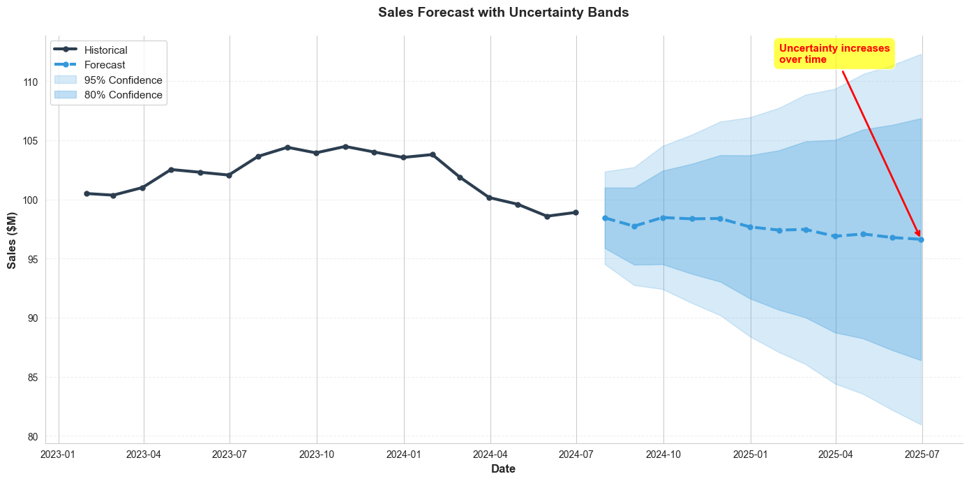
2. Confidence Bands for Time Series
Show uncertainty in trends and forecasts:
import matplotlib.pyplot as plt
import seaborn as sns
import pandas as pd
import numpy as np
# Generate sample forecast data
np.random.seed(42)
historical_dates = pd.date_range('2023-01-01', '2024-06-30', freq='M')
forecast_dates = pd.date_range('2024-07-01', '2025-06-30', freq='M')
historical_values = np.cumsum(np.random.randn(len(historical_dates))) + 100
forecast_mean = np.cumsum(np.random.randn(len(forecast_dates)) * 0.5) + historical_values[-1]
# Create confidence intervals (widening over time)
forecast_std = np.linspace(2, 8, len(forecast_dates))
forecast_lower_80 = forecast_mean - 1.28 * forecast_std
forecast_upper_80 = forecast_mean + 1.28 * forecast_std
forecast_lower_95 = forecast_mean - 1.96 * forecast_std
forecast_upper_95 = forecast_mean + 1.96 * forecast_std
fig, ax = plt.subplots(figsize=(14, 7))
# Historical data
ax.plot(historical_dates, historical_values, linewidth=3, color='#2c3e50',
label='Historical', marker='o', markersize=5)
# Forecast
ax.plot(forecast_dates, forecast_mean, linewidth=3, color='#3498db',
label='Forecast', linestyle='--', marker='o', markersize=5)
# Confidence intervals
ax.fill_between(forecast_dates, forecast_lower_95, forecast_upper_95,
alpha=0.2, color='#3498db', label='95% Confidence')
ax.fill_between(forecast_dates, forecast_lower_80, forecast_upper_80,
alpha=0.3, color='#3498db', label='80% Confidence')
# Formatting
ax.set_xlabel('Date', fontsize=12, fontweight='bold')
ax.set_ylabel('Sales ($M)', fontsize=12, fontweight='bold')
ax.set_title('Sales Forecast with Uncertainty Bands', fontsize=14, fontweight='bold', pad=20)
ax.legend(loc='upper left', fontsize=11)
ax.grid(axis='y', alpha=0.3, linestyle='--')
# Add annotation
ax.annotate('Uncertainty increases\nover time',
xy=(forecast_dates[-1], forecast_mean[-1]),
xytext=(forecast_dates[-6], forecast_mean[-1] + 15),
arrowprops=dict(arrowstyle='->', color='red', lw=2),
fontsize=11, color='red', fontweight='bold',
bbox=dict(boxstyle='round,pad=0.5', facecolor='yellow', alpha=0.7))
sns.despine()
plt.tight_layout()
plt.show()
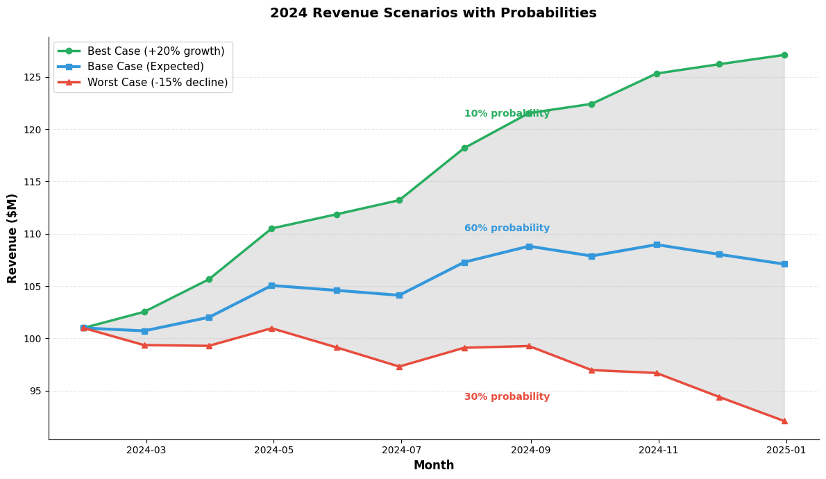
3. Scenario Analysis
Show multiple possible futures:
import matplotlib.pyplot as plt
import seaborn as sns
import pandas as pd
import numpy as np
# Generate scenario data
np.random.seed( 42 )
months = pd.date_range( '2024-01-01' , '2024-12-31' , freq= 'M' )
base_case = np.cumsum(np.random.randn(len(months)) * 2 ) + 100
best_case = base_case + np.linspace( 0 , 20 , len(months))
worst_case = base_case - np.linspace( 0 , 15 , len(months))
fig, ax = plt.subplots(figsize=( 12 , 7 ))
# Plot scenarios
ax.plot(months, best_case, linewidth= 2.5 , color= '#27ae60' ,
label= 'Best Case (+20% growth)' , marker= 'o' , markersize= 6 )
ax.plot(months, base_case, linewidth= 3 , color= '#3498db' ,
label= 'Base Case (Expected)' , marker= 's' , markersize= 6 )
ax.plot(months, worst_case, linewidth= 2.5 , color= '#e74c3c' , label= 'Worst Case (-15% decline)' , marker= '^' , markersize= 6 )
ax.fill_between(months, worst_case, best_case, alpha= 0.2 , color= 'gray' )
ax.text(months[ 6 ], best_case[ 6 ] + 3 , '10% probability' , fontsize= 10 , color= '#27ae60' , fontweight= 'bold' )
ax.text(months[ 6 ], base_case[ 6 ] + 3 , '60% probability' , fontsize= 10 , color= '#3498db' , fontweight= 'bold' )
ax.text(months[ 6 ], worst_case[ 6 ] - 5 , '30% probability' , fontsize= 10 , color= '#e74c3c' , fontweight= 'bold' )
ax.set_xlabel( 'Month' , fontsize= 12 , fontweight= 'bold' )
ax.set_ylabel( 'Revenue ($M)' , fontsize= 12 , fontweight= 'bold' )
ax.set_title( '2024 Revenue Scenarios with Probabilities' , fontsize= 14 , fontweight= 'bold' , pad= 20 )
ax.legend(loc= 'upper left' , fontsize= 11 )
ax.grid(axis= 'y' , alpha= 0.3 , linestyle= '--' )
sns.despine()
plt.tight_layout()
plt.show()
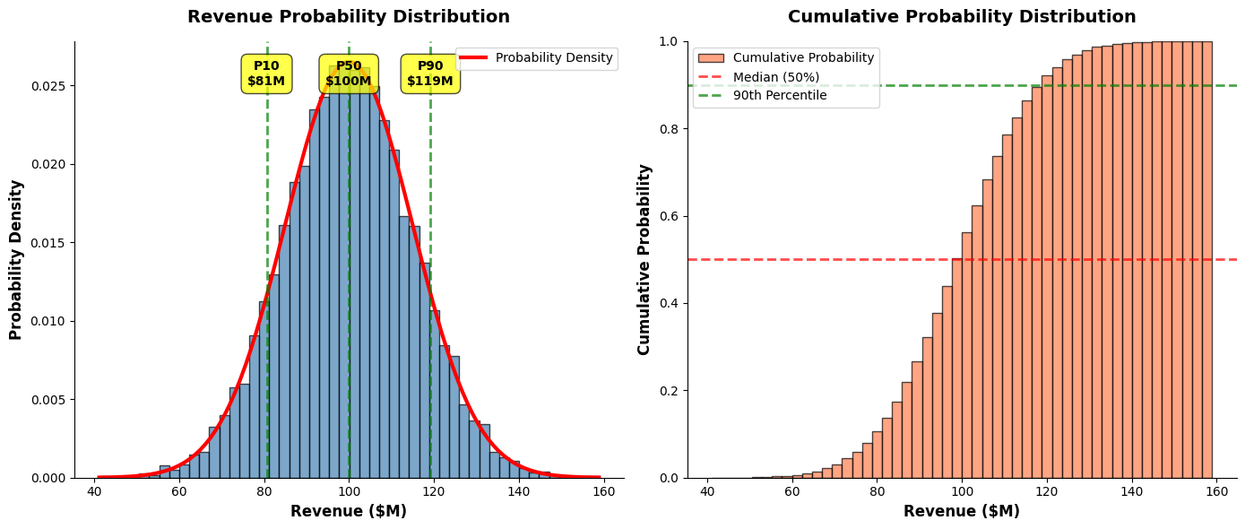
4. Probability Distributions
Show the full range of possible outcomes:
import matplotlib.pyplot as plt
import seaborn as sns
import numpy as np
from scipy import stats
# Generate probability distribution
np.random.seed(42)
outcomes = np.random.normal(100, 15, 10000)
fig, (ax1, ax2) = plt.subplots(1, 2, figsize=(14, 6))
# Histogram with probability density
ax1.hist(outcomes, bins=50, density=True, alpha=0.7, color='steelblue', edgecolor='black')
# Add normal curve
mu, sigma = outcomes.mean(), outcomes.std()
x = np.linspace(outcomes.min(), outcomes.max(), 100)
ax1.plot(x, stats.norm.pdf(x, mu, sigma), 'r-', linewidth=3, label='Probability Density')
# Mark key percentiles
percentiles = [10, 50, 90]
for p in percentiles:
val = np.percentile(outcomes, p)
ax1.axvline(val, color='green', linestyle='--', linewidth=2, alpha=0.7)
ax1.text(val, ax1.get_ylim()[1] * 0.9, f'P{p}\n${val:.0f}M',
ha='center', fontsize=10, fontweight='bold',
bbox=dict(boxstyle='round,pad=0.5', facecolor='yellow', alpha=0.7))
ax1.set_xlabel('Revenue ($M)', fontsize=12, fontweight='bold')
ax1.set_ylabel('Probability Density', fontsize=12, fontweight='bold')
ax1.set_title('Revenue Probability Distribution', fontsize=14, fontweight='bold', pad=15)
ax1.legend()
# Cumulative distribution
ax2.hist(outcomes, bins=50, density=True, cumulative=True,
alpha=0.7, color='coral', edgecolor='black', label='Cumulative Probability')
# Add reference lines
ax2.axhline(0.5, color='red', linestyle='--', linewidth=2, alpha=0.7, label='Median (50%)')
ax2.axhline(0.9, color='green', linestyle='--', linewidth=2, alpha=0.7, label='90th Percentile')
ax2.set_xlabel('Revenue ($M)', fontsize=12, fontweight='bold')
ax2.set_ylabel('Cumulative Probability', fontsize=12, fontweight='bold')
ax2.set_title('Cumulative Probability Distribution', fontsize=14, fontweight='bold', pad=15)
ax2.legend()
ax2.set_ylim(0, 1)
sns.despine()
plt.tight_layout()
plt.show()
5. Gradient/Intensity Maps for Uncertainty
#Use color intensity to show confidence:
import matplotlib.pyplot as plt
import seaborn as sns
import pandas as pd
import numpy as np
# Generate data with varying uncertainty
np.random.seed(42)
categories = ['Q1', 'Q2', 'Q3', 'Q4']
products = ['Product A', 'Product B', 'Product C', 'Product D']
# Sales estimates
sales = np.random.randint(50, 150, size=(len(products), len(categories)))
# Confidence levels (0-1, where 1 is high confidence)
confidence = np.array([
[0.9, 0.85, 0.7, 0.5], # Product A: decreasing confidence
[0.95, 0.9, 0.85, 0.8], # Product B: consistently high
[0.6, 0.65, 0.7, 0.75], # Product C: increasing confidence
[0.8, 0.75, 0.7, 0.65] # Product D: decreasing confidence
])
fig, (ax1, ax2) = plt.subplots(1, 2, figsize=(16, 6))
# Heatmap 1: Sales values
sns.heatmap(sales, annot=True, fmt='d', cmap='YlOrRd',
xticklabels=categories, yticklabels=products,
cbar_kws={'label': 'Sales ($K)'}, ax=ax1)
ax1.set_title('Forecasted Sales by Product and Quarter', fontsize=14, fontweight='bold', pad=15)
# Heatmap 2: Confidence levels
sns.heatmap(confidence, annot=True, fmt='.0%', cmap='RdYlGn',
xticklabels=categories, yticklabels=products,
vmin=0, vmax=1, cbar_kws={'label': 'Confidence Level'}, ax=ax2)
ax2.set_title('Forecast Confidence Levels', fontsize=14, fontweight='bold', pad=15)
plt.tight_layout()
plt.show()

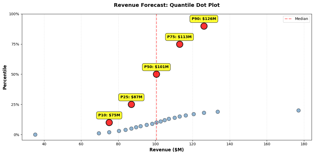
6. Quantile Dot Plots
Show discrete probability outcomes:
import matplotlib.pyplot as plt
import numpy as np
# Generate quantile data (e.g., from Monte Carlo simulation)
np.random.seed(42)
outcomes = np.random.normal(100, 20, 1000)
quantiles = np.percentile(outcomes, np.arange(0, 101, 1))
fig, ax = plt.subplots(figsize=(12, 6))
# Create dot plot
for i, q in enumerate(quantiles[::5]): # Every 5th percentile
ax.scatter([q], [i/5], s=100, color='steelblue', alpha=0.6, edgecolors='black', linewidth=1)
# Highlight key percentiles
key_percentiles = [10, 25, 50, 75, 90]
for p in key_percentiles:
val = np.percentile(outcomes, p)
y_pos = p / 5
ax.scatter([val], [y_pos], s=300, color='red', alpha=0.8,
edgecolors='black', linewidth=2, zorder=5)
ax.text(val, y_pos + 1, f'P{p}: ${val:.0f}M',
ha='center', fontsize=10, fontweight='bold',
bbox=dict(boxstyle='round,pad=0.5', facecolor='yellow', alpha=0.8))
# Add median line
median = np.percentile(outcomes, 50)
ax.axvline(median, color='red', linestyle='--', linewidth=2, alpha=0.5, label='Median')
ax.set_xlabel('Revenue ($M)', fontsize=12, fontweight='bold')
ax.set_ylabel('Percentile', fontsize=12, fontweight='bold')
ax.set_title('Revenue Forecast: Quantile Dot Plot', fontsize=14, fontweight='bold', pad=20)
ax.set_yticks(np.arange(0, 21, 5))
ax.set_yticklabels(['0%', '25%', '50%', '75%', '100%'])
ax.grid(axis='x', alpha=0.3, linestyle='--')
ax.legend()
plt.tight_layout()
plt.show()
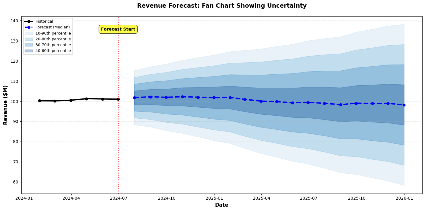
7. Fan Charts
Show expanding uncertainty over time:
import matplotlib.pyplot as plt
import pandas as pd
import numpy as np
# Generate fan chart data
np.random.seed(42)
dates = pd.date_range('2024-01-01', '2025-12-31', freq='M')
n = len(dates)
# Base forecast
base = np.cumsum(np.random.randn(n) * 0.5) + 100
# Create percentile bands
percentiles = [10, 20, 30, 40, 50, 60, 70, 80, 90]
bands = {}
for p in percentiles:
# Uncertainty grows over time
std = np.linspace(1, 10, n)
if p < 50:
bands[p] = base - (50 - p) / 10 * std
else:
bands[p] = base + (p - 50) / 10 * std
fig, ax = plt.subplots(figsize=(14, 7))
# Plot historical data (first 6 months)
historical_dates = dates[:6]
historical_values = base[:6]
ax.plot(historical_dates, historical_values, linewidth=3, color='black',
label='Historical', marker='o', markersize=6)
# Plot forecast median
forecast_dates = dates[6:]
forecast_median = base[6:]
ax.plot(forecast_dates, forecast_median, linewidth=3, color='blue',
label='Forecast (Median)', linestyle='--', marker='o', markersize=6)
# Plot fan (percentile bands)
colors = plt.cm.Blues(np.linspace(0.3, 0.9, len(percentiles) // 2))
for i in range(len(percentiles) // 2):
lower_p = percentiles[i]
upper_p = percentiles[-(i+1)]
ax.fill_between(forecast_dates,
bands[lower_p][6:],
bands[upper_p][6:],
alpha=0.3, color=colors[i],
label=f'{lower_p}-{upper_p}th percentile')
ax.set_xlabel('Date', fontsize=12, fontweight='bold')
ax.set_ylabel('Revenue ($M)', fontsize=12, fontweight='bold')
ax.set_title('Revenue Forecast: Fan Chart Showing Uncertainty',
fontsize=14, fontweight='bold', pad=20)
ax.legend(loc='upper left', fontsize=9)
ax.grid(axis='y', alpha=0.3, linestyle='--')
# Add vertical line separating historical from forecast
ax.axvline(dates[5], color='red', linestyle=':', linewidth=2, alpha=0.7)
ax.text(dates[5], ax.get_ylim()[1] * 0.95, 'Forecast Start',
ha='center', fontsize=10, fontweight='bold',
bbox=dict(boxstyle='round,pad=0.5', facecolor='yellow', alpha=0.7))
plt.tight_layout()
plt.show()
Best Practices for Communicating Uncertainty
✅ DO:
-
Always Show Uncertainty When It Exists
- Don't present point estimates without context
- Make uncertainty visible, not hidden in footnotes
-
Use Appropriate Visualization Techniques
- Error bars for comparisons
- Confidence bands for time series
- Distributions for complex uncertainty
-
Explain What Uncertainty Means
- Define confidence intervals in plain language
- Explain probability in terms of frequency
- Use concrete examples
-
Calibrate to Your Audience
- Executives: Scenarios with probabilities
- Analysts: Confidence intervals and distributions
- General audience: Simple ranges
-
Show the Range of Plausible Outcomes
- Not just best/worst case
- Include probabilities when possible
❌ DON'T:
-
Don't Hide Uncertainty
- Avoid presenting forecasts as certainties
- Don't omit error bars to make charts "cleaner"
-
Don't Overwhelm with Statistical Jargon
- Avoid unexplained terms like "95% CI"
- Don't assume statistical literacy
-
Don't Show False Precision
- Avoid reporting to many decimal places
- Don't imply more certainty than exists
-
Don't Use Only Worst/Best Case
- These are often unrealistic extremes
- Include most likely scenario
Communicating Risk: Additional Techniques
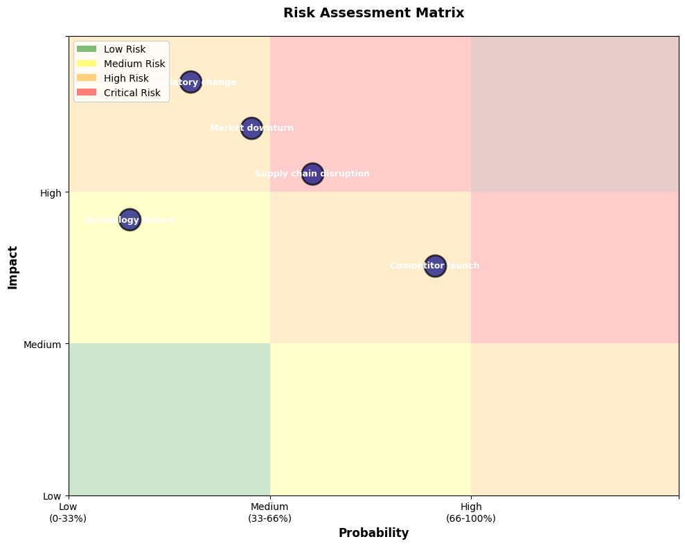
Risk Matrices
import matplotlib.pyplot as plt
import numpy as np
# Define risks
risks = [
{'name': 'Market downturn', 'probability': 0.3, 'impact': 0.8},
{'name': 'Competitor launch', 'probability': 0.6, 'impact': 0.5},
{'name': 'Supply chain disruption', 'probability': 0.4, 'impact': 0.7},
{'name': 'Regulatory change', 'probability': 0.2, 'impact': 0.9},
{'name': 'Technology failure', 'probability': 0.1, 'impact': 0.6},
]
fig, ax = plt.subplots(figsize=(10, 8))
# Create risk matrix background
ax.axhspan(0, 0.33, 0, 0.33, facecolor='green', alpha=0.2)
ax.axhspan(0, 0.33, 0.33, 0.66, facecolor='yellow', alpha=0.2)
ax.axhspan(0, 0.33, 0.66, 1, facecolor='orange', alpha=0.2)
ax.axhspan(0.33, 0.66, 0, 0.33, facecolor='yellow', alpha=0.2)
ax.axhspan(0.33, 0.66, 0.33, 0.66, facecolor='orange', alpha=0.2)
ax.axhspan(0.33, 0.66, 0.66, 1, facecolor='red', alpha=0.2)
ax.axhspan(0.66, 1, 0, 0.33, facecolor='orange', alpha=0.2)
ax.axhspan(0.66, 1, 0.33, 0.66, facecolor='red', alpha=0.2)
ax.axhspan(0.66, 1, 0.66, 1, facecolor='darkred', alpha=0.2)
# Plot risks
for risk in risks:
ax.scatter(risk['probability'], risk['impact'], s=500,
color='navy', alpha=0.7, edgecolors='black', linewidth=2)
ax.text(risk['probability'], risk['impact'], risk['name'],
ha='center', va='center', fontsize=9, fontweight='bold', color='white')
# Labels and formatting
ax.set_xlabel('Probability', fontsize=12, fontweight='bold')
ax.set_ylabel('Impact', fontsize=12, fontweight='bold')
ax.set_title('Risk Assessment Matrix', fontsize=14, fontweight='bold', pad=20)
ax.set_xlim(0, 1)
ax.set_ylim(0, 1)
ax.set_xticks([0, 0.33, 0.66, 1])
ax.set_xticklabels(['Low\n(0-33%)', 'Medium\n(33-66%)', 'High\n(66-100%)', ''])
ax.set_yticks([0, 0.33, 0.66, 1])
ax.set_yticklabels(['Low', 'Medium', 'High', ''])
# Add legend
from matplotlib.patches import Patch
legend_elements = [
Patch(facecolor='green', alpha=0.5, label='Low Risk'),
Patch(facecolor='yellow', alpha=0.5, label='Medium Risk'),
Patch(facecolor='orange', alpha=0.5, label='High Risk'),
Patch(facecolor='red', alpha=0.5, label='Critical Risk')
]
ax.legend(handles=legend_elements, loc='upper left', fontsize=10)
plt.tight_layout()
plt.show()
Tornado Diagrams (Sensitivity Analysis)
import matplotlib.pyplot as plt
import numpy as np
# Sensitivity analysis data
variables = ['Market Growth', 'Pricing', 'Cost of Goods', 'Marketing Spend', 'Churn Rate']
base_case = 100
# Impact of each variable (low and high scenarios)
low_impact = [-15, -12, -8, -6, -5]
high_impact = [20, 15, 10, 8, 7]
# Sort by total range
total_range = [abs(h - l) for h, l in zip(high_impact, low_impact)]
sorted_indices = np.argsort(total_range)[::-1]
variables_sorted = [variables[i] for i in sorted_indices]
low_sorted = [low_impact[i] for i in sorted_indices]
high_sorted = [high_impact[i] for i in sorted_indices]
fig, ax = plt.subplots(figsize=(12, 8))
y_pos = np.arange(len(variables_sorted))
# Plot bars
for i, (var, low, high) in enumerate(zip(variables_sorted, low_sorted, high_sorted)):
# Low scenario (left)
ax.barh(i, low, left=base_case, height=0.8,
color='#e74c3c', alpha=0.7, edgecolor='black', linewidth=1.5)
# High scenario (right)
ax.barh(i, high, left=base_case, height=0.8,
color='#27ae60', alpha=0.7, edgecolor='black', linewidth=1.5)
# Add value labels
ax.text(base_case + low - 2, i, f'{base_case + low:.0f}',
ha='right', va='center', fontsize=10, fontweight='bold')
ax.text(base_case + high + 2, i, f'{base_case + high:.0f}',
ha='left', va='center', fontsize=10, fontweight='bold')
# Base case line
ax.axvline(base_case, color='black', linestyle='--', linewidth=2, label='Base Case')
# Formatting
ax.set_yticks(y_pos)
ax.set_yticklabels(variables_sorted, fontsize=11)
ax.set_xlabel('Revenue Impact ($M)', fontsize=12, fontweight='bold')
ax.set_title('Tornado Diagram: Sensitivity Analysis\n(Ranked by Impact Range)',
fontsize=14, fontweight='bold', pad=20)
ax.legend(['Base Case ($100M)', 'Downside Risk', 'Upside Potential'],
loc='lower right', fontsize=10)
ax.grid(axis='x', alpha=0.3, linestyle='--')
plt.tight_layout()
plt.show()
6.8 Best Practices and Common Pitfalls
Best Practices Summary
Design Principles
✅ Clarity Over Complexity
- Simplify ruthlessly
- One message per visualization
- Remove non-essential elements
✅ Accuracy and Honesty
- Represent data truthfully
- Show uncertainty
- Cite sources and limitations
✅ Audience-Centric Design
- Know your audience
- Match detail to expertise
- Use appropriate language
✅ Accessibility
- Colorblind-friendly palettes
- Sufficient contrast
- Clear labels and legends
✅ Consistency
- Uniform styling across dashboards
- Consistent color meanings
- Predictable layouts
Process Best Practices
✅ Start with the Question
- Define the decision to be made
- Identify the key insight
- Choose visualization accordingly
✅ Iterate and Test
- Get feedback from target audience
- Refine based on comprehension
- A/B test when possible
✅ Provide Context
- Comparisons (vs. target, prior period, benchmark)
- Annotations for key events
- Clear titles that state the message
✅ Enable Action
- Clear recommendations
- Highlight what needs attention
- Provide next steps
Common Pitfalls and How to Avoid Them
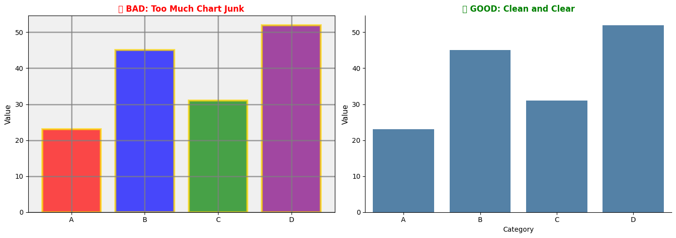
Pitfall 1: Chart Junk
Problem: Unnecessary decorative elements that distract from data.
Examples:
- 3D effects
- Excessive gridlines
- Decorative images
- Unnecessary shadows and gradients
Solution:
import matplotlib.pyplot as plt
import seaborn as sns
import pandas as pd
data = pd.DataFrame({
'Category': ['A', 'B', 'C', 'D'],
'Value': [23, 45, 31, 52]
})
fig, (ax1, ax2) = plt.subplots(1, 2, figsize=(14, 5))
# BAD: Chart junk
ax1.bar(data['Category'], data['Value'], color=['red', 'blue', 'green', 'purple'],
edgecolor='gold', linewidth=3, alpha=0.7)
ax1.grid(True, linestyle='-', linewidth=2, color='gray', alpha=0.7)
ax1.set_facecolor('#f0f0f0')
ax1.set_title(' BAD: Too Much Chart Junk', fontsize=12, fontweight='bold', color='red')
ax1.set_ylabel('Value', fontsize=11)
# GOOD: Clean design
sns.barplot(data=data, x='Category', y='Value', color='steelblue', ax=ax2)
ax2.set_title(' GOOD: Clean and Clear', fontsize=12, fontweight='bold', color='green')
ax2.set_ylabel('Value', fontsize=11)
sns.despine(ax=ax2)
plt.tight_layout()
plt.show()
Pitfall 2: Wrong Chart Type
Problem: Using a chart type that doesn't match the data or question.
Common Mistakes:
- Pie charts for more than 5 categories
- Line charts for non-sequential categories
- 3D pie charts (never!)
- Dual-axis charts that create false correlations
Solution: Use the Question-Chart Matrix (Section 6.2)
Pitfall 4: Information Overload
Problem: Too much data, too many series, too many colors.
Solution:
- Limit to 5-7 categories/series
- Use small multiples for many categories
- Provide drill-down instead of showing everything
- Focus on the most important information
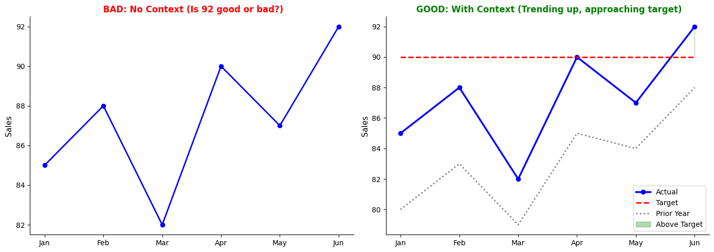
Pitfall 5: Missing Context
Problem: Charts without comparisons, benchmarks, or historical context.
Solution:
import matplotlib.pyplot as plt
import seaborn as sns
import pandas as pd
data = pd.DataFrame({
'Month': ['Jan', 'Feb', 'Mar', 'Apr', 'May', 'Jun'],
'Actual': [85, 88, 82, 90, 87, 92],
'Target': [90, 90, 90, 90, 90, 90],
'Prior_Year': [80, 83, 79, 85, 84, 88]
})
fig, (ax1, ax2) = plt.subplots(1, 2, figsize=(14, 5))
# BAD: No context
ax1.plot(data['Month'], data['Actual'], marker='o', linewidth=2, color='blue')
ax1.set_title(' BAD: No Context (Is 92 good or bad?)',
fontsize=12, fontweight='bold', color='red')
ax1.set_ylabel('Sales', fontsize=11)
# GOOD: With context
ax2.plot(data['Month'], data['Actual'], marker='o', linewidth=2.5,
color='blue', label='Actual')
ax2.plot(data['Month'], data['Target'], linestyle='--', linewidth=2,
color='red', label='Target')
ax2.plot(data['Month'], data['Prior_Year'], linestyle=':', linewidth=2,
color='gray', label='Prior Year')
ax2.fill_between(data['Month'], data['Actual'], data['Target'],
where=(data['Actual'] >= data['Target']),
alpha=0.3, color='green', label='Above Target')
ax2.set_title(' GOOD: With Context (Trending up, approaching target)',
fontsize=12, fontweight='bold', color='green')
ax2.set_ylabel('Sales', fontsize=11)
ax2.legend()
sns.despine()
plt.tight_layout()
plt.show()
Pitfall 6: Unclear Titles and Labels
Problem: Generic titles that don't convey the message.
Examples:
- ❌ "Sales Chart"
- ❌ "Q3 Data"
- ❌ "Regional Analysis"
Better:
- ✅ "Q3 Sales Declined 15% in Northeast Region"
- ✅ "Customer Satisfaction Improved Across All Segments"
- ✅ "Marketing ROI Highest in Digital Channels"
Pitfall 7: Ignoring Mobile/Print Formats
Problem: Visualizations that only work on large screens.
Solution:
- Test on different devices
- Use responsive design
- Ensure text is readable when printed
- Avoid tiny fonts and thin lines
Pitfall 8: Static When Interactive Would Help
Problem: Showing all data at once when filtering would be better.
Solution:
- Use interactive dashboards for exploration
- Provide filters for date ranges, categories
- Enable drill-down from summary to detail
- Consider tools like Plotly, Tableau, Power BI for interactivity
Pitfall 9: No Clear Call to Action
Problem: Presenting data without guiding the audience to a decision.
Solution:
- End with clear recommendations
- Highlight what needs attention
- Provide specific next steps
- Assign ownership and timelines
Checklist for Effective Visualizations
Before finalizing any visualization, verify:
Content:
- Clear, specific title that states the main message
- All axes labeled with units
- Data source and date cited
- Sample size noted (if relevant)
- Uncertainty shown (if applicable)
- Context provided (benchmarks, targets, comparisons)
Design:
- Appropriate chart type for the question
- Colorblind-friendly palette
- Sufficient contrast for readability
- Minimal chart junk
- Consistent styling
- Readable font sizes (minimum 10pt)
Accuracy:
- Scales are appropriate and honest
- Data represented truthfully
- No misleading visual encodings
- Limitations acknowledged
Audience:
- Appropriate detail level
- Language matches audience expertise
- Actionable for the decision context
- Tested with representative users
Example ChatGPT Prompts for Data Visualization
Use these prompts to get help with creating effective visualizations:
General Visualization Guidance
Prompt 1: Chart Selection
I have data showing [describe your data: e.g., "monthly sales for 5 products over 2 years"].
I want to answer the question: [your question: e.g., "Which product has the most consistent growth?"]
My audience is [executives/analysts/general audience].
What chart type should I use and why? Please provide Python code using matplotlib and seaborn.
Prompt 2: Improving an Existing Chart
I created a [chart type] to show [what you're showing], but it's not communicating effectively.
Here's my current code: [paste code]
The main message I want to convey is: [your message]
How can I improve this visualization? Please suggest specific design changes and provide updated code.
Specific Visualization Tasks
Prompt 3: Dashboard Layout
I need to create an executive dashboard showing these KPIs:
- Revenue (current vs. target)
- Customer satisfaction score (trend over 12 months)
- Regional performance (5 regions, actual vs. plan)
- Top 5 products by sales
The dashboard should fit on one screen and follow best practices for executive audiences.
Please provide a Python matplotlib layout with sample data and appropriate chart types.
Prompt 4: Showing Uncertainty
I have forecast data with confidence intervals:
- Forecast values: [list values]
- Lower bound (95% CI): [list values]
- Upper bound (95% CI): [list values]
- Time periods: [list periods]
Create a visualization that clearly shows the forecast uncertainty for a non-technical executive audience.
Use Python with matplotlib/seaborn.
Prompt 5: Comparison Visualization
I need to compare [what you're comparing: e.g., "performance of 3 marketing campaigns"]
across [dimensions: e.g., "cost, reach, and conversion rate"].
The goal is to identify which campaign offers the best ROI.
Please suggest an effective visualization approach and provide Python code with sample data.
Prompt 6: Time Series with Annotations
I have monthly sales data from Jan 2023 to Dec 2024. I want to:
- Show the trend line
- Highlight months where sales exceeded target
- Annotate key events (product launch in March 2024, promotion in July 2024)
- Include a forecast for the next 6 months with confidence bands
Please provide Python code using matplotlib/seaborn with best practices for time series visualization.
Prompt 7: Distribution Comparison
I have response time data for 4 different regions (100-200 data points per region).
I want to compare the distributions to identify which regions have:
- Highest median response time
- Most variability
- Outliers
What's the best way to visualize this? Please provide Python code with sample data.
Prompt 8: Colorblind-Friendly Palette
I'm creating a [chart type] with [number] categories.
Please provide a colorblind-friendly color palette and show me how to apply it in Python using matplotlib/seaborn.
Also explain why this palette is accessible.
Storytelling and Presentation
Prompt 9: Data Story Structure
I discovered that [your finding: e.g., "customer churn increased 20% in Q3 among 25-34 year-olds"].
The root cause is [cause: e.g., "poor mobile app experience"].
My recommendation is [recommendation: e.g., "invest $500K in app improvements"].
Help me structure this as a compelling data story for executive presentation.
Include:
- Opening hook
- Context and complication
- Supporting evidence structure
- Resolution and call to action
- Suggested visualizations for each section
Prompt 10: Tailoring to Audience
I need to present the same analysis to two audiences:
1. Executive team (15-minute presentation)
2. Analytics team (45-minute deep dive)
My analysis covers [describe analysis].
How should I adapt my visualizations and narrative for each audience?
Please provide specific guidance on what to include/exclude and how to structure each presentation.
Advanced Techniques
Prompt 11: Small Multiples
I have [metric] data for [number] categories over [time period].
I want to use small multiples to show trends for each category while enabling easy comparison.
Please provide Python code using seaborn FacetGrid with best practices for:
- Layout (rows/columns)
- Consistent scales
- Highlighting patterns
- Clear labeling
Prompt 12: Interactive Dashboard Concept
I want to create an interactive dashboard for [purpose] with these features:
- [Feature 1: e.g., "date range filter"]
- [Feature 2: e.g., "drill-down from region to store"]
- [Feature 3: e.g., "hover tooltips with details"]
I'm considering [Plotly/Dash/Streamlit/other].
Please provide:
1. Recommended tool and why
2. Basic code structure
3. Best practices for interactivity
Resources
Books
-
"The Visual Display of Quantitative Information" by Edward Tufte
- Classic text on data visualization principles
- Focus on maximizing data-ink ratio and minimizing chart junk
- https://www.edwardtufte.com/tufte/books_vdqi
-
"Storytelling with Data" by Cole Nussbaumer Knaflic
- Practical guide to creating effective business visualizations
- Emphasis on audience-centric design and narrative
- https://www.storytellingwithdata.com/books
-
"Information Dashboard Design" by Stephen Few
- Comprehensive guide to dashboard design
- Focus on executive and operational dashboards
- https://www.stephen few.com/
-
"The Truthful Art" by Alberto Cairo
- Data visualization for communication and understanding
- Emphasis on accuracy and honesty
- http://www.thefunctionalart.com/p/the-truthful-art-book.html
-
"Good Charts" by Scott Berinato
- Harvard Business Review guide to visualization
- Practical frameworks for business contexts
- https://store.hbr.org/product/good-charts-the-hbr-guide-to-making-smarter-more-persuasive-data-visualizations/10134
Online Resources
Visualization Galleries and Inspiration:
-
The Data Visualisation Catalogue
- Comprehensive chart type reference
- https://datavizcatalogue.com/
-
From Data to Viz
- Decision tree for chart selection
- https://www.data-to-viz.com/
-
The Python Graph Gallery
- Python code examples for every chart type
- https://python-graph-gallery.com/
-
Seaborn Gallery
- Official seaborn examples
- https://seaborn.pydata.org/examples/index.html
-
Matplotlib Gallery
- Official matplotlib examples
- https://matplotlib.org/stable/gallery/index.html
Color Tools:
-
ColorBrewer
- Colorblind-safe palettes for maps and charts
- https://colorbrewer2.org/
-
Coolors
- Color palette generator
- https://coolors.co/
-
Viz Palette
- Test palettes for colorblind accessibility
- https://projects.susielu.com/viz-palette
-
Adobe Color
- Color wheel and palette creation
- https://color.adobe.com/
Blogs and Communities:
-
Storytelling with Data Blog
- Regular posts on visualization best practices
- https://www.storytellingwithdata.com/blog
-
FlowingData
- Data visualization news and tutorials
- https://flowingdata.com/
-
Information is Beautiful
- Infographic inspiration and awards
- https://informationisbeautiful.net/
-
Nightingale (Data Visualization Society)
- Articles and community discussions
- https://nightingaledvs.com/
Tools and Libraries:
-
Matplotlib Documentation
-
Seaborn Documentation
-
Plotly Python
- Interactive visualizations
- https://plotly.com/python/
-
Altair
- Declarative visualization in Python
- https://altair-viz.github.io/
Academic Resources:
-
"Graphical Perception" by Cleveland and McGill (1984)
- Foundational research on visual encoding effectiveness
- https://www.jstor.org/stable/2288400
-
"Visualization Analysis and Design" by Tamara Munzner
- Academic textbook on visualization principles
- https://www.cs.ubc.ca/~tmm/vadbook/
Accessibility:
-
Web Content Accessibility Guidelines (WCAG)
- Standards for accessible design
- https://www.w3.org/WAI/WCAG21/quickref/
-
Coblis Color Blindness Simulator
- Test your visualizations for colorblind accessibility
- https://www.color-blindness.com/coblis-color-blindness-simulator/
Exercises
Exercise 1: Critique Charts
Objective: Develop critical evaluation skills by analyzing existing visualizations.
Instructions:
Find 3-5 data visualizations from business publications (e.g., Wall Street Journal, The Economist, company annual reports, business dashboards).
For each visualization, analyze:
-
Purpose and Audience
- What question is this chart answering?
- Who is the intended audience?
- What decision should this inform?
-
Design Choices
- Is the chart type appropriate?
- Are colors used effectively?
- Is the data-ink ratio optimized?
- Are there any elements of chart junk?
-
Accuracy and Honesty
- Are scales appropriate?
- Is uncertainty shown (if applicable)?
- Could this visualization mislead?
- Is context provided?
-
Effectiveness
- Can you understand the main message in 5 seconds?
- What works well?
- What could be improved?
-
Recommendations
- Suggest 2-3 specific improvements
- Sketch or describe an alternative design
Deliverable: A 2-3 page critique document with annotated screenshots and improvement recommendations.
Exercise 2: Redesign Charts
Objective: Practice applying visualization principles by redesigning poor charts.
Scenario:
You've been given the following poorly designed visualizations from your company's quarterly report. Redesign each one following best practices.
Chart A: Sales Performance (Misleading)
- 3D pie chart with 8 slices
- No labels on slices
- Rainbow color scheme
- Title: "Sales Data Q3"
Chart B: Time Series (Cluttered)
- Line chart with 12 overlapping product lines
- Truncated y-axis (starts at 95 instead of 0)
- No legend (colors not explained)
- Tiny font size
Chart C: Comparison (Confusing)
- Dual-axis chart comparing revenue (millions) and customer count (thousands)
- Different scales make correlation appear stronger than it is
- No indication of which axis corresponds to which metric
Instructions:
For each chart:
-
Identify Problems
- List all design issues
- Explain why each is problematic
- Reference specific principles from the chapter
-
Redesign
- Create an improved version using Python (matplotlib/seaborn)
- Explain your design choices
- Show before/after comparison
-
Alternative Approaches
- Suggest at least one alternative chart type
- Explain when this alternative would be preferable
Deliverable: Python code with visualizations and a 1-page explanation of your redesign decisions.
Sample Code Structure:
import matplotlib.pyplot as plt
import seaborn as sns
import pandas as pd
import numpy as np
# Sample data for Chart A (replace with actual data)
sales_data = pd.DataFrame({
'Product': ['A', 'B', 'C', 'D', 'E', 'F', 'G', 'H'],
'Sales': [150, 230, 180, 95, 210, 165, 140, 190]
})
# Create figure with before/after
fig, (ax1, ax2) = plt.subplots(1, 2, figsize=(16, 6))
# BEFORE: Poor design (simulated)
# [Your code for the problematic version]
# AFTER: Improved design
# [Your code for the improved version]
plt.tight_layout()
plt.show()
Exercise 3: Storyboard for Presentation
Objective: Practice data storytelling by creating a narrative structure for an analytical presentation.
Scenario:
You're a business analyst who has discovered that:
- Customer retention has declined from 88% to 82% over the past 6 months
- The decline is concentrated in the 25-34 age segment
- This segment has the highest lifetime value ($2,500 vs. $1,800 average)
- Exit surveys indicate the main reason is "poor mobile experience"
- Your mobile app has a 3.2-star rating vs. competitors' 4.5+ ratings
- A/B testing shows that improving the checkout flow increases conversion by 15%
- Estimated cost to fix: $500K
- Projected revenue impact if unaddressed: $5M over 12 months
Instructions:
Create a storyboard for a 15-minute executive presentation:
-
Narrative Structure
- Outline the story arc (context, conflict, resolution)
- Write the opening hook
- Define 3-5 key messages
- Craft the call to action
-
Slide Plan
- Create a slide-by-slide outline (8-12 slides)
- For each slide, specify:
- Slide title (should state the message, not just the topic)
- Visualization type
- Key data points to show
- Talking points
-
Visualization Sketches
- Sketch or describe each visualization
- Explain why you chose that chart type
- Note any annotations or highlights
-
Audience Adaptation
- Identify potential objections
- Prepare responses
- Anticipate questions
Deliverable: A storyboard document (PowerPoint outline or written document) with:
- Narrative arc description
- Slide-by-slide plan
- Visualization sketches or descriptions
- Speaker notes
Sample Slide Outline:
Slide 1: Title
- "Customer Retention Crisis: A $5M Risk and Our Path Forward"
- Simple title slide with key statistic
Slide 2: The Hook
- "We're Losing Our Most Valuable Customers"
- KPI card showing retention decline: 88% → 82%
- Highlight: "First decline in 5 years"
Slide 3: Who We're Losing
- "The Problem is Concentrated in Our Highest-Value Segment"
- Bar chart: Retention by age segment
- Highlight 25-34 segment in red
- Annotation: "$2,500 LTV vs. $1,800 average"
[Continue for remaining slides...]
Exercise 4: Draft Visual Options for Uncertainty
Objective: Practice communicating uncertainty using different visualization techniques.
Scenario:
You've created a 12-month revenue forecast with the following characteristics:
- Historical data: 24 months of actual revenue
- Forecast: 12 months ahead
- Uncertainty increases over time
- Three scenarios: Best case (+20%), Base case (expected), Worst case (-15%)
- Confidence intervals: 80% and 95%
- Key assumption: Market growth rate (uncertain)
Instructions:
Create four different visualizations of this forecast, each using a different technique for showing uncertainty:
-
Confidence Bands
- Line chart with shaded confidence intervals
- Show both 80% and 95% bands
-
Scenario Analysis
- Multiple lines for best/base/worst cases
- Include probabilities
-
Fan Chart
- Show expanding uncertainty over time
- Use percentile bands
-
Probability Distribution
- Show distribution of outcomes at a specific future point (e.g., month 12)
- Include histogram and cumulative probability
For each visualization:
- Create the chart using Python
- Write a 2-3 sentence explanation of when this approach is most appropriate
- Note advantages and disadvantages
Deliverable: Python code generating all four visualizations with written commentary.
Sample Code Structure:
import matplotlib.pyplot as plt
import seaborn as sns
import pandas as pd
import numpy as np
# Generate sample forecast data
np.random.seed(42)
# Historical data (24 months)
historical_dates = pd.date_range('2023-01-01', '2024-12-31', freq='M')
historical_revenue = np.cumsum(np.random.randn(len(historical_dates)) * 2) + 100
# Forecast data (12 months)
forecast_dates = pd.date_range('2025-01-01', '2025-12-31', freq='M')
forecast_base = np.cumsum(np.random.randn(len(forecast_dates)) * 0.5) + historical_revenue[-1]
# Add uncertainty (grows over time)
time_factor = np.linspace(1, 3, len(forecast_dates))
forecast_std = 3 * time_factor
# Calculate confidence intervals
forecast_lower_80 = forecast_base - 1.28 * forecast_std
forecast_upper_80 = forecast_base + 1.28 * forecast_std
forecast_lower_95 = forecast_base - 1.96 * forecast_std
forecast_upper_95 = forecast_base + 1.96 * forecast_std
# Scenarios
forecast_best = forecast_base * 1.20
forecast_worst = forecast_base * 0.85
# Create visualizations
fig, axes = plt.subplots(2, 2, figsize=(16, 12))
# Visualization 1: Confidence Bands
# [Your code here]
# Visualization 2: Scenario Analysis
# [Your code here]
# Visualization 3: Fan Chart
# [Your code here]
# Visualization 4: Probability Distribution
# [Your code here]
plt.tight_layout()
plt.show()
Reflection Questions:
After creating all four visualizations, answer:
- Which visualization would you use for an executive audience? Why?
- Which visualization would you use for a technical/analyst audience? Why?
- Which visualization best communicates the increasing uncertainty over time?
- What are the trade-offs between simplicity and completeness in uncertainty visualization?
Chapter Summary
Data visualization and storytelling are essential skills for translating analytical insights into business impact. This chapter covered:
Key Principles:
- Effective visualization requires clarity, accuracy, and audience-centric design
- Every chart should answer a specific question and inform a decision
- Simplicity and honesty are paramount—remove chart junk and represent data truthfully
Chart Selection:
- Different questions require different chart types
- Match the visualization to both the data structure and the insight
- Consider audience expertise and decision context
Cognitive Psychology:
- Understand pre-attentive attributes and Gestalt principles
- Minimize cognitive load through thoughtful design
- Use the hierarchy of visual encodings (position > length > area > color)
Avoiding Pitfalls:
- Truncated axes, inconsistent scales, and cherry-picked data mislead
- Design with accessibility in mind (colorblind-friendly palettes, sufficient contrast)
- Provide context through comparisons, benchmarks, and annotations
Dashboard Design:
- Executive dashboards: High-level, exception-based, fit on one screen
- Analyst dashboards: Detailed, interactive, exploration-focused
- Adapt layout, interactivity, and detail level to audience needs
Data Storytelling:
- Stories are 22x more memorable than facts alone
- Use narrative structure: Context → Conflict → Resolution
- Tailor your story to stakeholder priorities and decision context
- Combine data, narrative, and visuals for maximum impact
Communicating Uncertainty:
- Always show uncertainty when it exists
- Use confidence intervals, scenario analysis, and probability distributions
- Match the technique to audience sophistication
- Make risk visible and interpretable
Best Practices:
- Start with the question, not the chart type
- Iterate based on feedback
- Test for accessibility and comprehension
- Provide clear calls to action
By mastering these principles and techniques, you'll transform data into compelling visual narratives that drive understanding, alignment, and action across your organization.