Chapter 14. Forecasting Methods for Business Planning
Forecasting is the backbone of business planning, enabling organizations to anticipate demand, allocate resources, manage inventory, and make strategic decisions under uncertainty. Whether predicting next quarter's sales, forecasting customer demand, or estimating cash flow, accurate forecasts reduce risk and improve operational efficiency. This chapter explores the fundamental concepts, methods, and practical implementation of time series forecasting, with a focus on translating forecasts into actionable business insights.
14.1 The Role of Forecasting in Organizations
Forecasting is the process of making predictions about future events based on historical data and analysis. In business, forecasting informs decisions across all functional areas:
Operational Forecasting:
- Demand Forecasting: Predict product demand to optimize inventory and production.
- Workforce Planning: Forecast staffing needs based on expected workload.
- Supply Chain Management: Anticipate supplier lead times and logistics requirements.
Financial Forecasting:
- Revenue Projections: Estimate future sales for budgeting and investor communications.
- Cash Flow Forecasting: Predict cash inflows and outflows to manage liquidity.
- Expense Planning: Anticipate costs for resource allocation.
Strategic Forecasting:
- Market Trends: Identify long-term industry shifts and opportunities.
- Scenario Planning: Model different future scenarios (optimistic, pessimistic, realistic).
- Capacity Planning: Determine infrastructure and capital investment needs.
Why Forecasting Matters:
- Reduces Uncertainty: Provides a data-driven basis for decision-making.
- Improves Efficiency: Aligns resources with anticipated needs, reducing waste.
- Enables Proactivity: Allows organizations to prepare for future challenges and opportunities.
- Supports Accountability: Creates measurable targets for performance evaluation.
The Challenge:
All forecasts are wrong to some degree—the goal is to make them useful . Effective forecasting balances accuracy with interpretability, acknowledges uncertainty, and adapts as new information becomes available.
14.2 Time Series Components: Trend, Seasonality, Cycles, Noise
A time series is a sequence of data points indexed in time order. Understanding its components is essential for choosing appropriate forecasting methods.
1. Trend (T)
Definition: The long-term direction or movement in the data (upward, downward, or flat).
Examples:
- Increasing sales over several years due to market growth.
- Declining manufacturing costs due to technological improvements.
Identification: Plot the data and look for consistent upward or downward movement over time.
2. Seasonality (S)
Definition: Regular, predictable patterns that repeat at fixed intervals (daily, weekly, monthly, quarterly, yearly).
Examples:
- Retail sales spike during holiday seasons.
- Electricity demand peaks in summer (air conditioning) and winter (heating).
- Website traffic increases on weekdays and decreases on weekends.
Identification: Look for repeating patterns at consistent intervals. Seasonal plots and autocorrelation functions (ACF) can reveal seasonality.
3. Cycles (C)
Definition: Longer-term fluctuations that are not fixed in frequency, often driven by economic or business cycles.
Examples:
- Economic recessions and expansions.
- Industry-specific boom-and-bust cycles.
Difference from Seasonality: Cycles are irregular in length and amplitude, while seasonality is regular and predictable.
4. Noise (N) / Irregular Component
Definition: Random, unpredictable fluctuations that cannot be attributed to trend, seasonality, or cycles.
Examples:
- One-time events (natural disasters, strikes, pandemics).
- Measurement errors.
- Random variations in customer behavior.
Decomposition Models
Time series can be decomposed into these components using two models:
Additive Model:
Yt=Tt+St+Ct+Nt
Use when seasonal variations are roughly constant over time.
Multiplicative Model:
Yt=Tt×St×Ct×Nt
Use when seasonal variations increase or decrease proportionally with the trend.
14.3 Baseline Forecasting Methods
Before applying complex models, establish baseline forecasts to benchmark performance.
14.3.1 Naïve Forecast
Definition: The forecast for the next period equals the actual value from the most recent period.
Y^t+1=Yt
Use Case: Simple, works well for stable time series without trend or seasonality.
Seasonal Naïve Forecast:
For seasonal data, use the value from the same season in the previous cycle:
Y^t+m=Yt
Where m is the seasonal period (e.g., 12 for monthly data with yearly seasonality).
Moving Averages
Definition: The forecast is the average of the last n observations.
Y^t+1=n1i=0∑n−1Yt−i
Advantages:
- Smooths out short-term fluctuations.
- Simple to compute and interpret.
Disadvantages:
- Lags behind trends.
- All past observations are weighted equally.
- Requires choosing n (window size).
Choosing n:
- Smaller n: More responsive to recent changes but noisier.
- Larger n: Smoother but slower to react to changes.
14.3.2 Exponential Smoothing
Definition: A weighted average where recent observations receive exponentially decreasing weights.
Simple Exponential Smoothing (SES):
Y^t+1=αYt+(1−α)Y^t
Where:
- α is the smoothing parameter (0 < α < 1).
- Higher α: More weight on recent observations (responsive).
- Lower α: More weight on historical data (smooth).
Advantages:
- Only requires storing the last forecast and observation.
- Adapts to changes more smoothly than moving averages.
Holt's Linear Trend Method:
Extends SES to capture trends by adding a trend component.
Holt-Winters Method:
Further extends to capture both trend and seasonality (additive or multiplicative).
14.4 Classical Time Series Models
14.4.1 ARIMA and SARIMA
ARIMA (AutoRegressive Integrated Moving Average) is one of the most widely used time series forecasting methods, combining three components:
Understanding ARIMA Parameters: (p, d, q)
1. AR (AutoRegressive) - p:
The model uses past values (lags) of the series to predict future values.
Yt=c+ϕ1Yt−1+ϕ2Yt−2+...+ϕpYt−p+ϵt
- p: Number of lag observations (order of AR).
- Interpretation: Current value depends on previous p values.
- Example: If p=2, today's sales depend on sales from the last 2 days.
How to determine p:
- Look at the Partial Autocorrelation Function (PACF) plot.
- Significant spikes at lag k suggest including that lag.
- PACF cuts off after lag p for an AR(p) process.
2. I (Integrated) - d:
The number of times the series must be differenced to make it stationary.
Differencing:
Yt′=Yt−Yt−1
- d: Order of differencing.
- d=0: Series is already stationary.
- d=1: First difference (removes linear trend).
- d=2: Second difference (removes quadratic trend, rarely needed).
Why Stationarity Matters:
ARIMA requires the series to be stationary (constant mean, variance, and autocorrelation over time). Non-stationary series can lead to spurious results.
How to determine d:
- Visual inspection: Does the series have a trend?
- Statistical tests: Augmented Dickey-Fuller (ADF) test.
- If ADF test p-value > 0.05, series is non-stationary; apply differencing.
3. MA (Moving Average) - q:
The model uses past forecast errors to predict future values.
Yt=c+ϵt+θ1ϵt−1+θ2ϵt−2+...+θqϵt−q
- q: Number of lagged forecast errors (order of MA).
- Interpretation: Current value depends on previous q forecast errors.
How to determine q:
- Look at the Autocorrelation Function (ACF) plot.
- Significant spikes at lag k suggest including that lag.
- ACF cuts off after lag q for an MA(q) process.
ARIMA Model Selection Process
- Check Stationarity: Use ADF test and visual inspection.
- Determine d: Apply differencing until series is stationary.
- Examine ACF and PACF: Identify potential p and q values.
- Fit Multiple Models: Try different combinations of (p, d, q).
- Compare Models: Use AIC (Akaike Information Criterion) or BIC (Bayesian Information Criterion). Lower is better.
- Validate: Check residuals for randomness (white noise).
SARIMA (Seasonal ARIMA)
SARIMA(p, d, q)(P, D, Q)m extends ARIMA to handle seasonality.
Additional Parameters:
- P: Seasonal AR order.
- D: Seasonal differencing order.
- Q: Seasonal MA order.
- m: Number of periods per season (e.g., 12 for monthly data with yearly seasonality).
Example: SARIMA(1,1,1)(1,1,1,12) for monthly sales data with yearly seasonality.
14.4.2 Random Forest for Time Series
While Random Forest is traditionally used for cross-sectional data, it can be adapted for time series forecasting by creating lag features.
Approach:
- Create lag features: Yt−1,Yt−2,...,Yt−k
- Create time-based features: month, day of week, quarter, etc.
- Train Random Forest on these features to predict Yt.
Advantages:
- Captures non-linear relationships.
- Handles multiple features easily.
- No stationarity requirement.
Disadvantages:
- Requires careful feature engineering.
- Less interpretable than ARIMA.
- Can overfit if not properly validated.
14.4.3 Dealing with Trends and Seasonality
Detrending:
- Differencing: Subtract previous value(s).
- Regression: Fit a trend line and model residuals.
- Transformation: Apply log or Box-Cox transformation to stabilize variance.
Deseasonalizing:
- Seasonal Differencing: Subtract value from same season in previous cycle.
- Seasonal Decomposition: Extract and remove seasonal component.
- Seasonal Dummies: Include binary variables for each season in regression models.
Combined Approach:
For data with both trend and seasonality, apply both seasonal and non-seasonal differencing, or use SARIMA.
14.4.4 1-Step Ahead, Multiple Step Ahead, and Rolling Predictions
1-Step Ahead Forecast:
Predict only the next time period. Most accurate because it uses the most recent actual data.
Multiple Step Ahead Forecast:
Predict several periods into the future (e.g., next 12 months).
Approaches:
- Direct Method: Train separate models for each horizon (h=1, h=2, ..., h=H).
- Recursive Method: Use 1-step ahead predictions as inputs for subsequent predictions.
- Direct-Recursive Hybrid: Combine both approaches.
Rolling Predictions (Walk-Forward Validation):
Simulate real-world forecasting by:
- Train model on data up to time t.
- Predict time t+1.
- Observe actual value at t+1.
- Retrain model including t+1.
- Predict t+2.
- Repeat.
This provides a realistic assessment of forecast accuracy.
14.5 Important Forecasting Features
Beyond historical values, additional features can improve forecast accuracy:
Calendar Features:
- Day of week, month, quarter, year
- Holidays and special events
- Business days vs. weekends
Lag Features:
- Previous values: Yt−1,Yt−2,...
- Lagged differences: Yt−Yt−1
Rolling Statistics:
- Moving averages: mean of last n periods
- Rolling standard deviation: volatility measure
- Rolling min/max
External Variables (Exogenous Features):
- Economic indicators (GDP, unemployment rate)
- Weather data (temperature, precipitation)
- Marketing spend, promotions
- Competitor actions
Domain-Specific Features:
- Retail: Back-to-school season, Black Friday
- Energy: Heating/cooling degree days
- Finance: Market indices, interest rates
14.6 Forecast Accuracy Metrics
Evaluating forecast accuracy is essential for model selection and improvement.
Common Metrics
1. Mean Absolute Error (MAE):
MAE=n1i=1∑n∣Yi−Y^i∣
- Interpretation: Average absolute difference between actual and predicted values.
- Advantages: Easy to interpret, same units as data.
- Disadvantages: Doesn't penalize large errors more than small ones.
2. Mean Squared Error (MSE):
MSE=n1i=1∑n(Yi−Y^i)2
- Interpretation: Average squared difference.
- Advantages: Penalizes large errors more heavily.
- Disadvantages: Not in original units, sensitive to outliers.
3. Root Mean Squared Error (RMSE):
RMSE=MSE
- Interpretation: Square root of MSE, in original units.
- Advantages: Penalizes large errors, interpretable scale.
4. Mean Absolute Percentage Error (MAPE):
MAPE=n100%i=1∑nYiYi−Y^i
- Interpretation: Average percentage error.
- Advantages: Scale-independent, easy to communicate.
- Disadvantages: Undefined when Yi=0, asymmetric (penalizes over-forecasts more than under-forecasts).
5. Symmetric Mean Absolute Percentage Error (sMAPE):
sMAPE=n100%i=1∑n(∣Yi∣+∣Y^i∣)/2∣Yi−Y^i∣
- Interpretation: Symmetric version of MAPE.
- Advantages: Treats over- and under-forecasts equally.
6. Mean Absolute Scaled Error (MASE):
MASE=MAEnaiveMAE
- Interpretation: MAE relative to naïve forecast.
- Advantages: Scale-independent, works with zero values, benchmarks against simple baseline.
- MASE < 1: Better than naïve forecast.
- MASE > 1: Worse than naïve forecast.
Choosing the Right Metric
- MAE/RMSE: When you want errors in original units.
- MAPE: When you want percentage errors and data doesn't contain zeros.
- MASE: When comparing across different series or scales.
- Business Context: Sometimes custom metrics aligned with business costs are most appropriate (e.g., cost of overstock vs. stockout).
14.7 Implementing Simple Forecasts in Python
Let's implement a complete forecasting workflow using publicly available data.
Step 1: Load and Explore Data
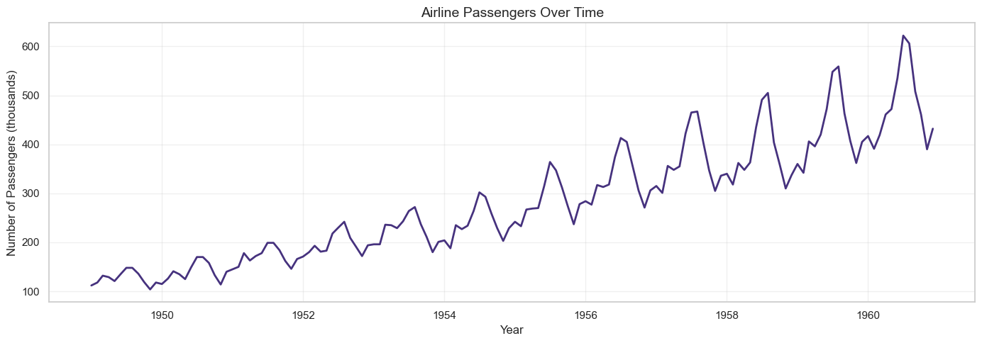
We'll use airline passenger data, a classic time series dataset.
import pandas as pd
import numpy as np
import matplotlib.pyplot as plt
import seaborn as sns
from statsmodels.tsa.seasonal import seasonal_decompose
from statsmodels.graphics.tsaplots import plot_acf, plot_pacf
from statsmodels.tsa.stattools import adfuller
from statsmodels.tsa.arima.model import ARIMA
from statsmodels.tsa.statespace.sarimax import SARIMAX
from sklearn.ensemble import RandomForestRegressor
from sklearn.metrics import mean_absolute_error, mean_squared_error
import warnings
warnings.filterwarnings('ignore')
# Load airline passenger data
url = 'https://raw.githubusercontent.com/jbrownlee/Datasets/master/airline-passengers.csv'
df = pd.read_csv(url)
df.columns = ['Month', 'Passengers']
df['Month'] = pd.to_datetime(df['Month'])
df.set_index('Month', inplace=True)
print(df.head())
print(f"\nDataset shape: {df.shape}")
print(f"Date range: {df.index.min()} to {df.index.max()}")
print(f"\nSummary statistics:\n{df.describe()}")
# Plot the time series
plt.figure(figsize=(14, 5))
plt.plot(df.index, df['Passengers'], linewidth=2)
plt.title('Airline Passengers Over Time', fontsize=14)
plt.xlabel('Year')
plt.ylabel('Number of Passengers (thousands)')
plt.grid(True, alpha=0.3)
plt.tight_layout()
plt.show()
Step 2: Time Series Decomposition
# Decompose time series into trend, seasonal, and residual components
# Use multiplicative model since seasonal variation increases over time
decomposition = seasonal_decompose(df['Passengers'], model='multiplicative', period=12)
fig, axes = plt.subplots(4, 1, figsize=(14, 10))
# Original
axes[0].plot(df.index, df['Passengers'], color='blue')
axes[0].set_ylabel('Original')
axes[0].set_title('Time Series Decomposition (Multiplicative)', fontsize=14)
axes[0].grid(True, alpha=0.3)
# Trend
axes[1].plot(df.index, decomposition.trend, color='orange')
axes[1].set_ylabel('Trend')
axes[1].grid(True, alpha=0.3)
# Seasonal
axes[2].plot(df.index, decomposition.seasonal, color='green')
axes[2].set_ylabel('Seasonal')
axes[2].grid(True, alpha=0.3)
# Residual
axes[3].plot(df.index, decomposition.resid, color='red')
axes[3].set_ylabel('Residual')
axes[3].set_xlabel('Year')
axes[3].grid(True, alpha=0.3)
plt.tight_layout()
plt.show()
# Extract components
trend = decomposition.trend
seasonal = decomposition.seasonal
residual = decomposition.resid
print(f"Trend component range: {trend.min():.2f} to {trend.max():.2f}")
print(f"Seasonal component range: {seasonal.min():.2f} to {seasonal.max():.2f}")
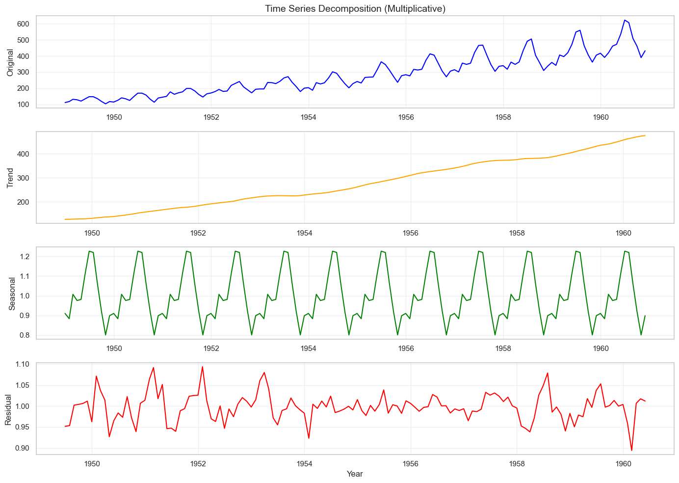
Trend component range: 126.79 to 475.04
Seasonal component range: 0.80 to 1.23
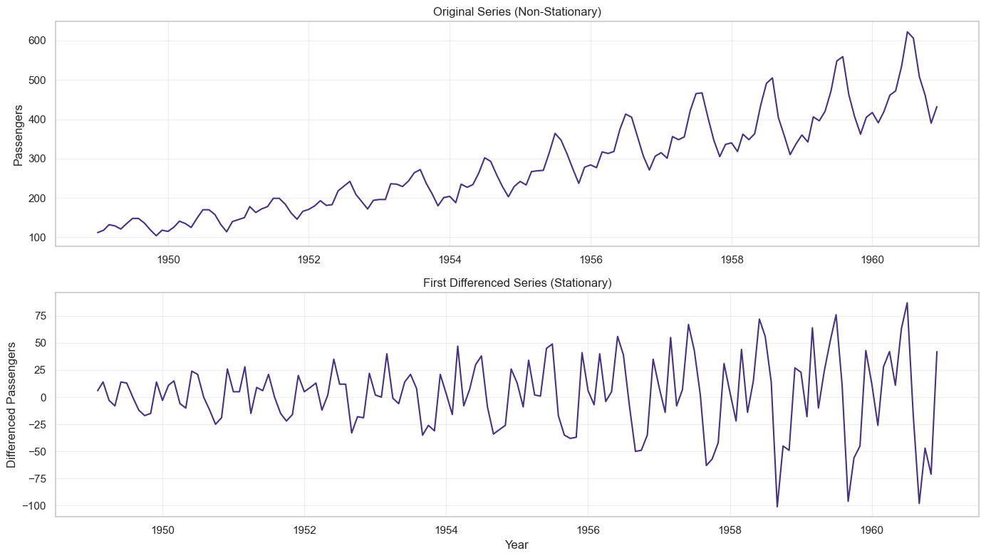
Step 3: Stationarity Testing
def adf_test(series, name=''):
"""Perform Augmented Dickey-Fuller test for stationarity"""
result = adfuller(series.dropna())
print(f'\n--- ADF Test Results for {name} ---')
print(f'ADF Statistic: {result[0]:.6f}')
print(f'p-value: {result[1]:.6f}')
print(f'Critical Values:')
for key, value in result[4].items():
print(f' {key}: {value:.3f}')
if result[1] <= 0.05:
print(f"Result: Series is STATIONARY (reject null hypothesis, p={result[1]:.4f})")
else:
print(f"Result: Series is NON-STATIONARY (fail to reject null hypothesis, p={result[1]:.4f})")
return result[1]
# Test original series
adf_test(df['Passengers'], 'Original Series')
# Apply first differencing
df['Passengers_diff1'] = df['Passengers'].diff()
# Test differenced series
adf_test(df['Passengers_diff1'], 'First Differenced Series')
# Visualize differencing
fig, axes = plt.subplots(2, 1, figsize=(14, 8))
axes[0].plot(df.index, df['Passengers'])
axes[0].set_title('Original Series (Non-Stationary)', fontsize=12)
axes[0].set_ylabel('Passengers')
axes[0].grid(True, alpha=0.3)
axes[1].plot(df.index, df['Passengers_diff1'])
axes[1].set_title('First Differenced Series (Stationary)', fontsize=12)
axes[1].set_ylabel('Differenced Passengers')
axes[1].set_xlabel('Year')
axes[1].grid(True, alpha=0.3)
plt.tight_layout()
plt.show()
Output
--- ADF Test Results for Original Series ---
ADF Statistic: 0.815369
p-value: 0.991880
Critical Values:
1%: -3.482
5%: -2.884
10%: -2.579
Result: Series is NON-STATIONARY (fail to reject null hypothesis, p=0.9919)
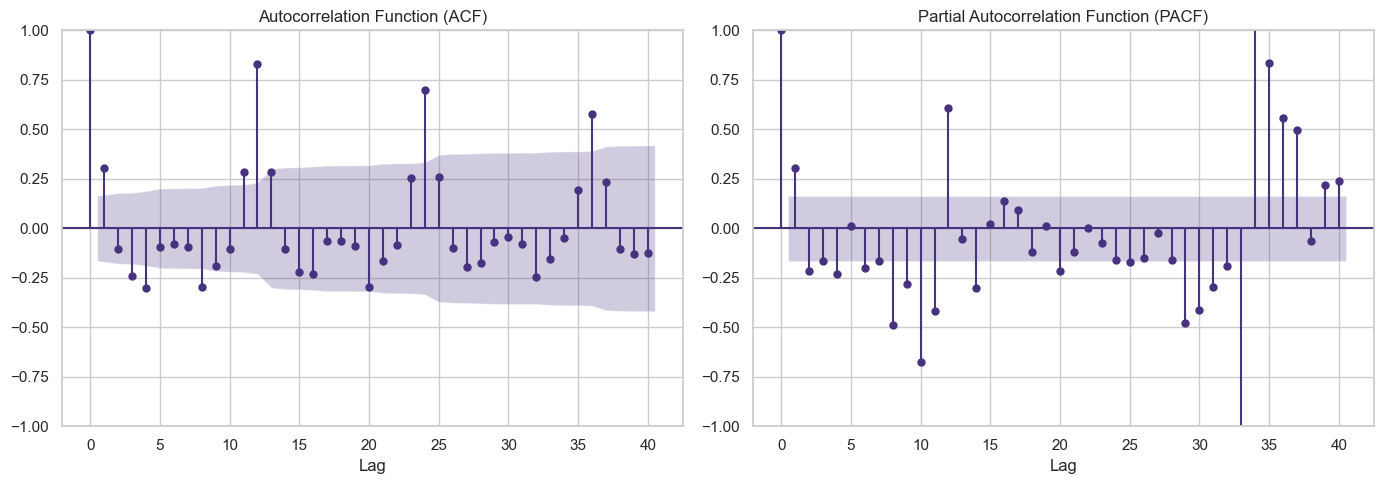
Step 4: Autocorrelation: ACF and PACF Analysis
# Plot ACF and PACF for differenced series
fig, axes = plt.subplots(1, 2, figsize=(14, 5))
# ACF plot - helps determine MA order (q)
plot_acf(df['Passengers_diff1'].dropna(), lags=40, ax=axes[0])
axes[0].set_title('Autocorrelation Function (ACF)', fontsize=12)
axes[0].set_xlabel('Lag')
# PACF plot - helps determine AR order (p)
plot_pacf(df['Passengers_diff1'].dropna(), lags=40, ax=axes[1])
axes[1].set_title('Partial Autocorrelation Function (PACF)', fontsize=12)
axes[1].set_xlabel('Lag')
plt.tight_layout()
plt.show()
Output:
- ACF shows significant spikes at seasonal lags (12, 24, 36), indicating seasonal MA component
- PACF shows significant spikes at early lags, suggesting AR component
- Strong seasonality visible at lag 12 suggests seasonal ARIMA (SARIMA)
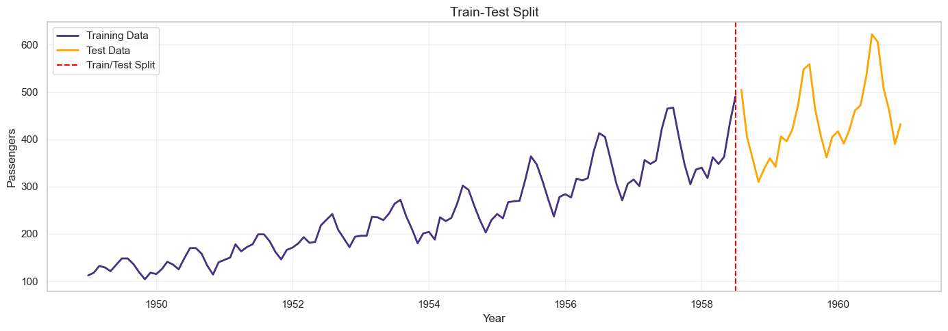
Step 5: Train-Test Split
# Split data: 80% train, 20% test
train_size = int(len(df) * 0.8)
train = df['Passengers'][:train_size]
test = df['Passengers'][train_size:]
print(f"Training set: {len(train)} observations ({train.index.min()} to {train.index.max()})")
print(f"Test set: {len(test)} observations ({test.index.min()} to {test.index.max()})")
# Visualize split
plt.figure(figsize=(14, 5))
plt.plot(train.index, train, label='Training Data', linewidth=2)
plt.plot(test.index, test, label='Test Data', linewidth=2, color='orange')
plt.axvline(x=train.index[-1], color='red', linestyle='--', label='Train/Test Split')
plt.title('Train-Test Split', fontsize=14)
plt.xlabel('Year')
plt.ylabel('Passengers')
plt.legend()
plt.grid(True, alpha=0.3)
plt.tight_layout()
plt.show()
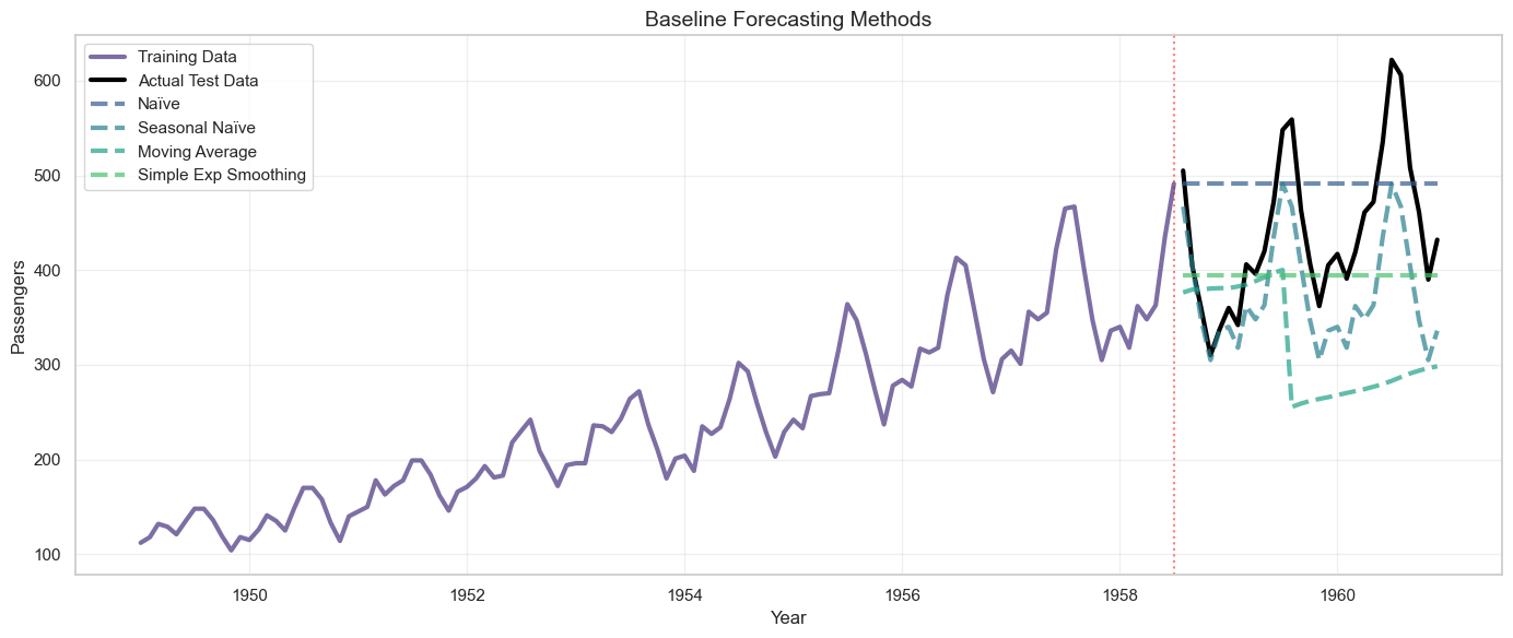
Step 6: Baseline Methods
# 1. Naïve Forecast
naive_forecast = [train.iloc[-1]] * len(test)
# 2. Seasonal Naïve Forecast
seasonal_naive_forecast = []
for i in range(len(test)):
# Use value from same month in previous year
seasonal_naive_forecast.append(train.iloc[-(12 - i % 12)])
# 3. Moving Average (window=12)
ma_window = 12
ma_forecast = []
for i in range(len(test)):
if i == 0:
window_data = train.iloc[-ma_window:]
else:
window_data = pd.concat([train.iloc[-ma_window+i:], test.iloc[:i]])
ma_forecast.append(window_data.mean())
# 4. Simple Exponential Smoothing
from statsmodels.tsa.holtwinters import SimpleExpSmoothing
ses_model = SimpleExpSmoothing(train)
ses_fit = ses_model.fit(smoothing_level=0.2, optimized=False)
ses_forecast = ses_fit.forecast(steps=len(test))
# Evaluate baseline methods
def evaluate_forecast(actual, predicted, method_name):
mae = mean_absolute_error(actual, predicted)
rmse = np.sqrt(mean_squared_error(actual, predicted))
mape = np.mean(np.abs((actual - predicted) / actual)) * 100
print(f"\n{method_name}:")
print(f" MAE: {mae:.2f}")
print(f" RMSE: {rmse:.2f}")
print(f" MAPE: {mape:.2f}%")
return {'Method': method_name, 'MAE': mae, 'RMSE': rmse, 'MAPE': mape}
results = []
results.append(evaluate_forecast(test, naive_forecast, 'Naïve Forecast'))
results.append(evaluate_forecast(test, seasonal_naive_forecast, 'Seasonal Naïve'))
results.append(evaluate_forecast(test, ma_forecast, 'Moving Average (12)'))
results.append(evaluate_forecast(test, ses_forecast, 'Simple Exp Smoothing'))
# Visualize baseline forecasts
plt.figure(figsize=(14, 6))
plt.plot(train.index, train, label='Training Data', linewidth=2, alpha=0.7)
plt.plot(test.index, test, label='Actual Test Data', linewidth=2, color='black')
plt.plot(test.index, naive_forecast, label='Naïve', linestyle='--', alpha=0.7)
plt.plot(test.index, seasonal_naive_forecast, label='Seasonal Naïve', linestyle='--', alpha=0.7)
plt.plot(test.index, ma_forecast, label='Moving Average', linestyle='--', alpha=0.7)
plt.plot(test.index, ses_forecast, label='Simple Exp Smoothing', linestyle='--', alpha=0.7)
plt.axvline(x=train.index[-1], color='red', linestyle=':', alpha=0.5)
plt.title('Baseline Forecasting Methods', fontsize=14)
plt.xlabel('Year')
plt.ylabel('Passengers')
plt.legend(loc='upper left')
plt.grid(True, alpha=0.3)
plt.tight_layout()
plt.show()
Naïve Forecast:
MAE: 81.45
RMSE: 93.13
MAPE: 20.20%
Seasonal Naïve:
MAE: 64.76
RMSE: 75.23
MAPE: 14.04%
Moving Average (12):
MAE: 132.50
RMSE: 161.25
MAPE: 28.11%
Simple Exp Smoothing:
MAE: 66.93
RMSE: 90.67
MAPE: 13.92%
Step 7: ARIMA Model
# Fit ARIMA model
# Based on ACF/PACF analysis, try ARIMA(1,1,1)
arima_model = ARIMA(train, order=(1, 1, 1))
arima_fit = arima_model.fit()
print("\n" + "="*60)
print("ARIMA(1,1,1) Model Summary")
print("="*60)
print(arima_fit.summary())
# Forecast
arima_forecast = arima_fit.forecast(steps=len(test))
# Evaluate
results.append(evaluate_forecast(test, arima_forecast, 'ARIMA(1,1,1)'))
# Check residuals
residuals = arima_fit.resid
fig, axes = plt.subplots(2, 2, figsize=(14, 8))
# Residuals over time
axes[0, 0].plot(residuals)
axes[0, 0].set_title('ARIMA Residuals Over Time')
axes[0, 0].set_xlabel('Observation')
axes[0, 0].set_ylabel('Residual')
axes[0, 0].axhline(y=0, color='red', linestyle='--')
axes[0, 0].grid(True, alpha=0.3)
# Residuals histogram
axes[0, 1].hist(residuals, bins=20, edgecolor='black')
axes[0, 1].set_title('Residuals Distribution')
axes[0, 1].set_xlabel('Residual')
axes[0, 1].set_ylabel('Frequency')
axes[0, 1].grid(True, alpha=0.3)
# ACF of residuals
plot_acf(residuals, lags=30, ax=axes[1, 0])
axes[1, 0].set_title('ACF of Residuals')
# Q-Q plot
from scipy import stats
stats.probplot(residuals, dist="norm", plot=axes[1, 1])
axes[1, 1].set_title('Q-Q Plot')
axes[1, 1].grid(True, alpha=0.3)
plt.tight_layout()
plt.show()
# Ljung-Box test for residual autocorrelation
from statsmodels.stats.diagnostic import acorr_ljungbox
lb_test = acorr_ljungbox(residuals, lags=[10, 20, 30], return_df=True)
print("\nLjung-Box Test (tests if residuals are white noise):")
print(lb_test)
print("\nIf p-values > 0.05, residuals are white noise (good!)")
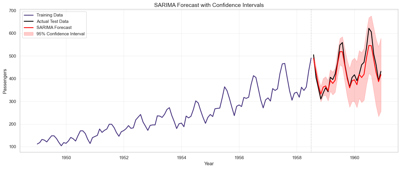
Step 8: SARIMA Model
# Fit SARIMA model with seasonal component
# SARIMA(p,d,q)(P,D,Q,m) where m=12 for monthly data
# Try SARIMA(1,1,1)(1,1,1,12)
sarima_model = SARIMAX(train, order=(1, 1, 1), seasonal_order=(1, 1, 1, 12))
sarima_fit = sarima_model.fit(disp=False)
print("\n" + "="*60)
print("SARIMA(1,1,1)(1,1,1,12) Model Summary")
print("="*60)
print(sarima_fit.summary())
# Forecast
sarima_forecast = sarima_fit.forecast(steps=len(test))
# Evaluate
results.append(evaluate_forecast(test, sarima_forecast, 'SARIMA(1,1,1)(1,1,1,12)'))
# Get confidence intervals
sarima_forecast_obj = sarima_fit.get_forecast(steps=len(test))
sarima_ci = sarima_forecast_obj.conf_int()
# Visualize SARIMA forecast with confidence intervals
plt.figure(figsize=(14, 6))
plt.plot(train.index, train, label='Training Data', linewidth=2)
plt.plot(test.index, test, label='Actual Test Data', linewidth=2, color='black')
plt.plot(test.index, sarima_forecast, label='SARIMA Forecast', linewidth=2, color='red')
plt.fill_between(test.index, sarima_ci.iloc[:, 0], sarima_ci.iloc[:, 1],
color='red', alpha=0.2, label='95% Confidence Interval')
plt.axvline(x=train.index[-1], color='gray', linestyle=':', alpha=0.5)
plt.title('SARIMA Forecast with Confidence Intervals', fontsize=14)
plt.xlabel('Year')
plt.ylabel('Passengers')
plt.legend()
plt.grid(True, alpha=0.3)
plt.tight_layout()
plt.show()
Output
SARIMA(1,1,1)(1,1,1,12):
MAE: 23.55
RMSE: 30.14
MAPE: 5.05%
Step 9: Auto ARIMA (Automated Model Selection)
# Use pmdarima for automatic ARIMA model selection
try:
from pmdarima import auto_arima
print("\nRunning Auto ARIMA (this may take a minute)...")
auto_model = auto_arima(train,
seasonal=True,
m=12, # seasonal period
start_p=0, start_q=0,
max_p=3, max_q=3,
start_P=0, start_Q=0,
max_P=2, max_Q=2,
d=None, # let auto_arima determine d
D=None, # let auto_arima determine D
trace=True,
error_action='ignore',
suppress_warnings=True,
stepwise=True)
print("\n" + "="*60)
print("Best Model Selected by Auto ARIMA")
print("="*60)
print(auto_model.summary())
# Forecast
auto_forecast = auto_model.predict(n_periods=len(test))
# Evaluate
results.append(evaluate_forecast(test, auto_forecast, f'Auto ARIMA {auto_model.order}x{auto_model.seasonal_order}'))
except ImportError:
print("\npmdarima not installed. Install with: pip install pmdarima")
auto_forecast = None
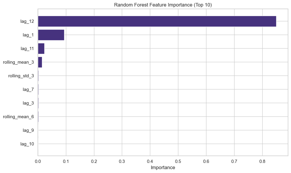
Step 10: Random Forest with Lag Features
import pandas as pd
import matplotlib.pyplot as plt
from sklearn.ensemble import RandomForestRegressor
# Create lag features for Random Forest
def create_lag_features(data, n_lags=12):
df_lags = pd.DataFrame(index=data.index)
df_lags['target'] = data.values
# Lag features
for i in range(1, n_lags + 1):
df_lags[f'lag_{i}'] = data.shift(i)
# Rolling statistics
df_lags['rolling_mean_3'] = data.shift(1).rolling(window=3).mean()
df_lags['rolling_mean_6'] = data.shift(1).rolling(window=6).mean()
df_lags['rolling_std_3'] = data.shift(1).rolling(window=3).std()
# Time features
df_lags['month'] = df_lags.index.month
df_lags['quarter'] = df_lags.index.quarter
df_lags['year'] = df_lags.index.year
return df_lags
# Prepare data
df_lags = create_lag_features(df['Passengers'], n_lags=12)
# Drop rows with NaN after all features are created
df_lags = df_lags.dropna()
# Ensure train and test indices are in df_lags
train_rf = df_lags.loc[df_lags.index.intersection(train.index)]
test_rf = df_lags.loc[df_lags.index.intersection(test.index)]
X_train = train_rf.drop('target', axis=1)
y_train = train_rf['target']
X_test = test_rf.drop('target', axis=1)
y_test = test_rf['target']
print(f"\nRandom Forest features: {list(X_train.columns)}")
print(f"Training samples: {len(X_train)}, Test samples: {len(X_test)}")
# Train Random Forest
rf_model = RandomForestRegressor(n_estimators=100, max_depth=10, random_state=42)
rf_model.fit(X_train, y_train)
# Predict
rf_forecast = rf_model.predict(X_test)
# Evaluate
results.append(evaluate_forecast(y_test, rf_forecast, 'Random Forest'))
# Feature importance
feature_importance = pd.DataFrame({
'feature': X_train.columns,
'importance': rf_model.feature_importances_
}).sort_values('importance', ascending=False)
print("\nTop 10 Most Important Features:")
print(feature_importance.head(10))
# Visualize feature importance
plt.figure(figsize=(10, 6))
plt.barh(feature_importance['feature'][:10], feature_importance['importance'][:10])
plt.xlabel('Importance')
plt.title('Random Forest Feature Importance (Top 10)')
plt.gca().invert_yaxis()
plt.tight_layout()
plt.show()
Random Forest:
MAE: 36.36
RMSE: 52.90
MAPE: 7.54%
Step 11: Rolling Forecast (Walk-Forward Validation)
# Implement rolling forecast for SARIMA
def rolling_forecast_sarima(train_data, test_data, order, seasonal_order):
predictions = []
history = list(train_data)
for t in range(len(test_data)):
model = SARIMAX(history, order=order, seasonal_order=seasonal_order)
model_fit = model.fit(disp=False)
yhat = model_fit.forecast(steps=1)[0]
predictions.append(yhat)
# Add actual observation to history
history.append(test_data.iloc[t])
if (t + 1) % 5 == 0:
print(f"Completed {t + 1}/{len(test_data)} rolling forecasts")
return predictions
print("\nPerforming rolling forecast with SARIMA...")
rolling_predictions = rolling_forecast_sarima(train, test,
order=(1, 1, 1),
seasonal_order=(1, 1, 1, 12))
# Evaluate rolling forecast
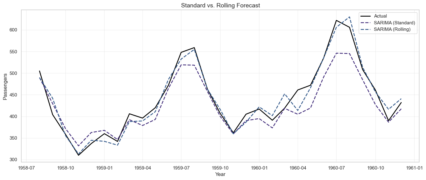
results.append(evaluate_forecast(test, rolling_predictions, 'SARIMA (Rolling)'))
# Visualize rolling vs. standard forecast
plt.figure(figsize=(14, 6))
plt.plot(test.index, test, label='Actual', linewidth=2, color='black')
plt.plot(test.index, sarima_forecast, label='SARIMA (Standard)', linestyle='--', linewidth=2)
plt.plot(test.index, rolling_predictions, label='SARIMA (Rolling)', linestyle='--', linewidth=2)
plt.title('Standard vs. Rolling Forecast', fontsize=14)
plt.xlabel('Year')
plt.ylabel('Passengers')
plt.legend()
plt.grid(True, alpha=0.3)
plt.tight_layout()
plt.show()
Output
SARIMA (Rolling):
MAE: 13.01
RMSE: 17.24
MAPE: 2.99%
14.8 Communicating Forecasts and Uncertainty
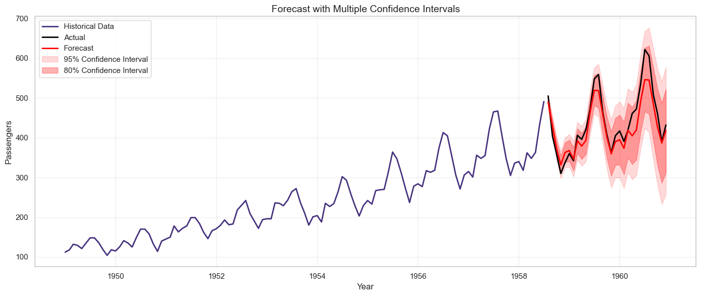
Forecasts are inherently uncertain. Communicating this uncertainty effectively is crucial for building trust and enabling informed decision-making.
Presenting Forecast Uncertainty
1. Confidence Intervals:
Show a range of plausible values rather than a single point estimate.
# Example: SARIMA with 80% and 95% confidence intervals
sarima_forecast_obj = sarima_fit.get_forecast(steps=len(test))
sarima_ci_95 = sarima_forecast_obj.conf_int(alpha=0.05) # 95% CI
sarima_ci_80 = sarima_forecast_obj.conf_int(alpha=0.20) # 80% CI
plt.figure(figsize=(14, 6))
plt.plot(train.index, train, label='Historical Data', linewidth=2)
plt.plot(test.index, test, label='Actual', linewidth=2, color='black')
plt.plot(test.index, sarima_forecast, label='Forecast', linewidth=2, color='red')
plt.fill_between(test.index, sarima_ci_95.iloc[:, 0], sarima_ci_95.iloc[:, 1],
color='red', alpha=0.15, label='95% Confidence Interval')
plt.fill_between(test.index, sarima_ci_80.iloc[:, 0], sarima_ci_80.iloc[:, 1],
color='red', alpha=0.3, label='80% Confidence Interval')
plt.title('Forecast with Multiple Confidence Intervals', fontsize=14)
plt.xlabel('Year')
plt.ylabel('Passengers')
plt.legend()
plt.grid(True, alpha=0.3)
plt.tight_layout()
plt.show()
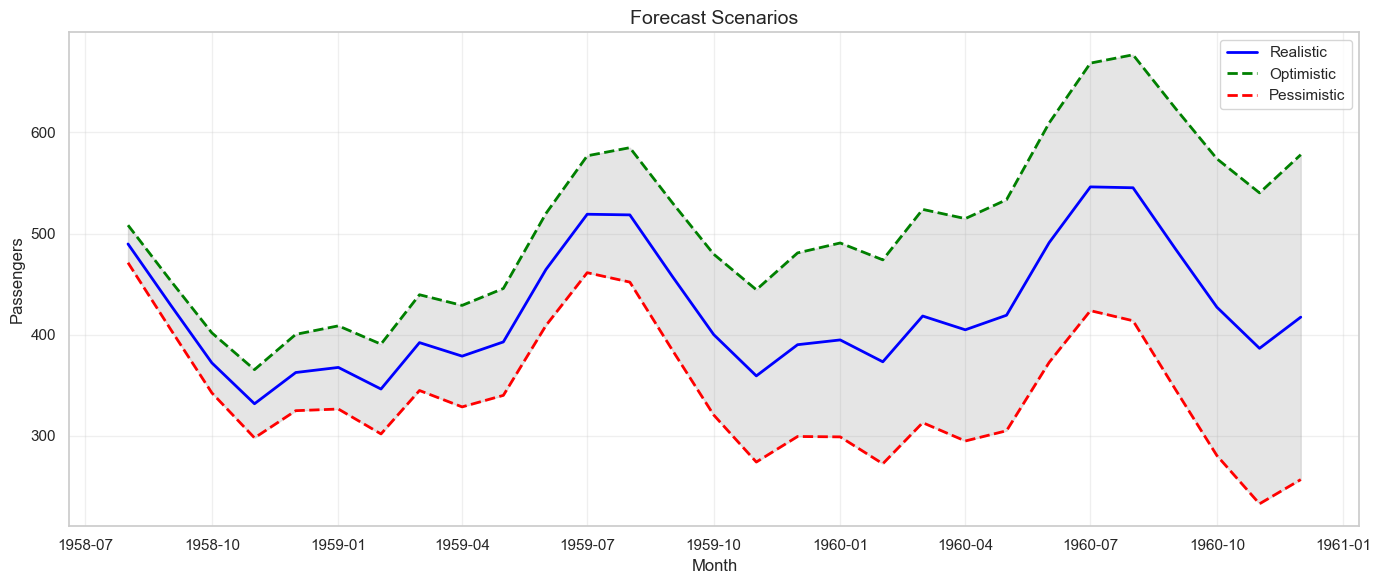
2. Scenario Analysis:
Present optimistic, realistic, and pessimistic scenarios.
# Create scenarios based on confidence intervals
scenarios = pd.DataFrame({
'Month': test.index,
'Pessimistic': sarima_ci_95.iloc[:, 0],
'Realistic': sarima_forecast,
'Optimistic': sarima_ci_95.iloc[:, 1]
})
print("\nForecast Scenarios:")
print(scenarios.head(10))
# Visualize scenarios
plt.figure(figsize=(14, 6))
plt.plot(scenarios['Month'], scenarios['Realistic'], label='Realistic', linewidth=2, color='blue')
plt.plot(scenarios['Month'], scenarios['Optimistic'], label='Optimistic', linestyle='--', linewidth=2, color='green')
plt.plot(scenarios['Month'], scenarios['Pessimistic'], label='Pessimistic', linestyle='--', linewidth=2, color='red')
plt.fill_between(scenarios['Month'], scenarios['Pessimistic'], scenarios['Optimistic'],
alpha=0.2, color='gray')
plt.title('Forecast Scenarios', fontsize=14)
plt.xlabel('Month')
plt.ylabel('Passengers')
plt.legend()
plt.grid(True, alpha=0.3)
plt.tight_layout()
plt.show()
Best Practices for Communicating Forecasts
1. Be Transparent About Assumptions:
- What data was used?
- What model was chosen and why?
- What assumptions were made (e.g., no major disruptions)?
2. Acknowledge Limitations:
- Forecasts become less accurate further into the future.
- Unexpected events (black swans) can invalidate forecasts.
- Models are based on historical patterns that may not continue.
3. Provide Context:
- Compare forecast to historical performance.
- Explain what drives the forecast (trend, seasonality, external factors).
- Relate forecast to business goals and benchmarks.
4. Use Visualizations:
- Charts are more intuitive than tables of numbers.
- Show historical data alongside forecasts for context.
- Use color and shading to distinguish actuals, forecasts, and confidence intervals.
5. Update Regularly:
- Forecasts should be living documents, updated as new data arrives.
- Track forecast accuracy over time and adjust models as needed.
Example Executive Brief
Subject: Q1 2025 Passenger Forecast
Summary: Based on historical data and seasonal patterns, we forecast 450,000 passengers in Q1 2025, representing a 12% increase over Q1 2024.
Forecast Range:
- Optimistic Scenario (95% upper bound): 480,000 passengers
- Realistic Scenario (point estimate): 450,000 passengers
- Pessimistic Scenario (95% lower bound): 420,000 passengers
Key Drivers:
- Strong upward trend over the past 5 years (+8% annual growth)
- Seasonal peak in January due to holiday travel
- No major disruptions anticipated
Assumptions:
- Economic conditions remain stable
- No significant changes in pricing or competition
- Historical seasonal patterns continue
Risks:
- Economic downturn could reduce travel demand
- New competitors entering the market
- Unexpected events (weather, geopolitical issues)
Recommendation: Plan capacity for 450,000 passengers, with contingency plans for the 420,000-480,000 range. Monitor actual performance monthly and update forecast as needed.
Exercises
Exercise 1: Decompose a Time Series into Trend and Seasonality
Dataset: Use the airline passenger data or another time series dataset of your choice.
Tasks:
- Load the data and create a time series plot.
- Perform seasonal decomposition using both additive and multiplicative models.
- Visualize the decomposed components (trend, seasonal, residual).
- Compare the two decomposition models. Which is more appropriate for this data and why?
- Calculate the strength of trend and seasonality:
- Strength of Trend = 1 - Var(Residual) / Var(Trend + Residual)
- Strength of Seasonality = 1 - Var(Residual) / Var(Seasonal + Residual)
- Write a brief interpretation of the decomposition results.
Deliverable: Python code, visualizations, and a written interpretation (1-2 paragraphs).
Exercise 2: Implement a Moving Average Forecast and Evaluate Its Accuracy
Tasks:
- Split the airline passenger data into training (80%) and test (20%) sets.
- Implement moving average forecasts with windows of 3, 6, and 12 months.
- For each window size, calculate MAE, RMSE, and MAPE on the test set.
- Visualize the forecasts alongside actual values.
- Discuss the trade-offs between different window sizes.
- Compare moving average to a naïve forecast. Which performs better?
Deliverable: Python code, comparison table, visualizations, and analysis.
Exercise 3: Compare Two Forecasting Approaches Using MAPE
Tasks:
- Implement two forecasting methods:
- Simple Exponential Smoothing
- SARIMA (use auto_arima or manually specify parameters)
- Generate forecasts for the test period.
- Calculate MAE, RMSE, MAPE, and MASE for both methods.
- Create a visualization comparing the two forecasts against actual values.
- Analyze the residuals for both models (plot residuals, ACF of residuals, histogram).
- Which model would you recommend for production use? Justify your choice considering both accuracy and interpretability.
Deliverable: Python code, metrics comparison table, visualizations, and recommendation (1 page).
Exercise 4: Draft a Brief for Executives Explaining Forecast Scenarios and Uncertainty Ranges
Scenario: You are forecasting monthly sales for the next 6 months. Your SARIMA model produces point estimates and 95% confidence intervals.
Tasks:
- Generate a 6-month forecast with confidence intervals using SARIMA.
- Create three scenarios: Pessimistic (lower bound), Realistic (point estimate), Optimistic (upper bound).
- Draft a one-page executive brief that includes:
- Summary of the forecast (headline numbers)
- Visualization showing historical data, forecast, and confidence intervals
- Key drivers of the forecast
- Assumptions made
- Risks and uncertainties
- Business recommendations based on the forecast
- Use clear, non-technical language suitable for executives without data science background.
Deliverable: Executive brief (1 page), supporting visualizations, and Python code used to generate the forecast.
Chapter Summary
Forecasting is both an art and a science, requiring technical skill, business judgment, and effective communication. This chapter covered the fundamental components of time series (trend, seasonality, cycles, noise), baseline and advanced forecasting methods (moving averages, exponential smoothing, ARIMA, SARIMA, Random Forest), and practical implementation in Python. We explored critical concepts like stationarity testing, ACF/PACF analysis, model selection, and forecast evaluation metrics. Most importantly, we emphasized that forecasts are only valuable when they are actionable, interpretable, and communicated with appropriate uncertainty . By mastering these techniques and principles, business analysts can provide forecasts that drive better planning, reduce risk, and create competitive advantage.